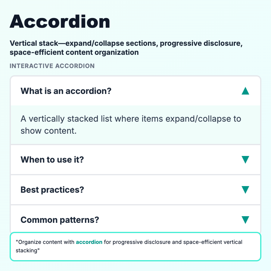
What is Accordion?
Accordions are collapsible sections that hide/show content on click. Users expand sections they care about, keeping the rest collapsed. Saves vertical space and reduces scrolling. Common in FAQs, settings, mobile menus. One or multiple sections can be open simultaneously.
When Should You Use This?
Use accordions for FAQs, long forms (group by category), settings panels, mobile navigation, or when you have many sections but users only need a few at a time. Great for progressive disclosure—show headings, hide details until needed. Always make headings descriptive so users know what's inside before expanding.
Common Mistakes to Avoid
- •Hiding critical content—first/most important section should be expanded by default
- •Too many levels—nested accordions are hard to navigate; limit to 2 levels
- •No expand/collapse all—when >5 sections, provide "expand all" control
- •Poor mobile touch targets—accordion headers need to be large enough to tap easily
- •Not keyboard accessible—accordions must work with Enter/Space and arrow keys
Real-World Examples
- •Stripe docs—expandable API reference, hides details until clicked
- •GitHub repo settings—sections collapsed by default, expand to configure
- •FAQ pages—every question is an accordion item
- •Linear filters—filter groups in collapsible accordions
Category
Information Architecture
Tags
accordioncollapsibleexpandableprogressive-disclosureui-pattern