What is Badge?
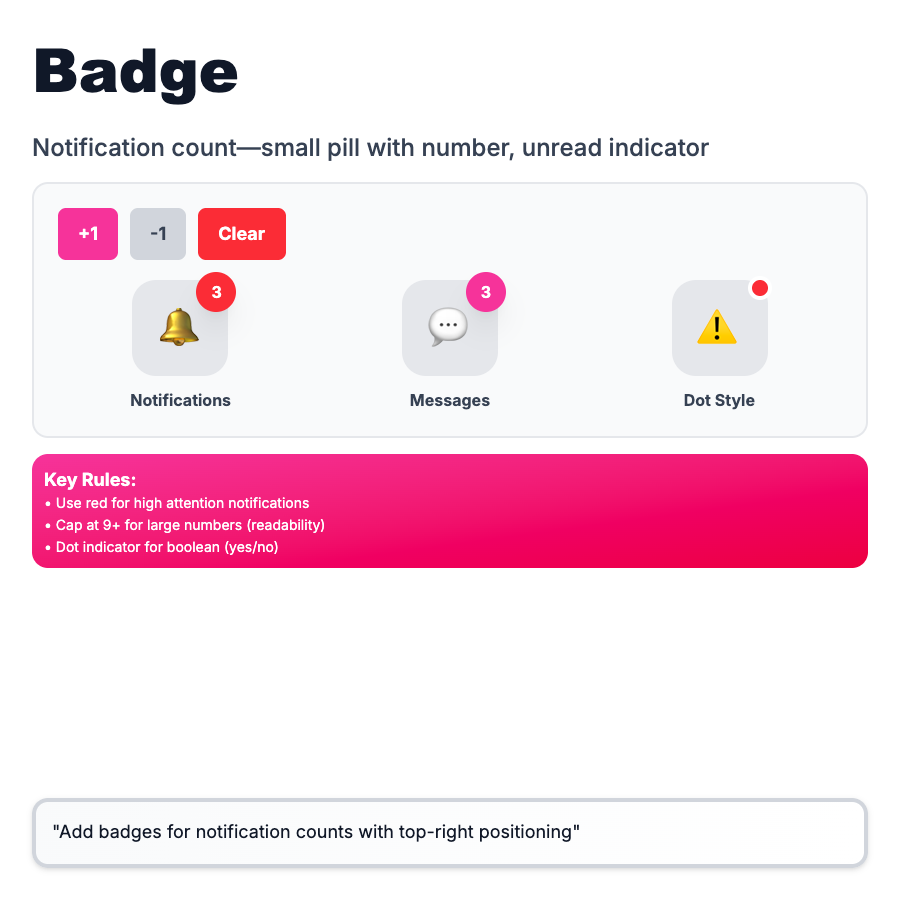
Badges are small, colored labels that indicate status (Active, Beta, New), counts (3 notifications), or categories (Bug, Feature). Draw attention to important info without taking much space. Appear next to or on top of other elements. Can be static (status) or dynamic (counts).
When Should You Use This?
Use badges for status indicators (Draft, Published, Paid), notification counts (5 unread), version labels (Beta, Pro), or categories/tags (Bug, Feature). Keep text short (1-3 words). Use color to convey meaning (red=error, green=success, blue=info). Don't overuse—too many badges create visual noise.
Common Mistakes to Avoid
- •Too many colors—limit to 5-7 semantic colors; too many and meaning is lost
- •Long text—badges should be scannable; "Processing payment" → "Processing"
- •Using for actions—badges are labels, not buttons; use button if clickable
- •No meaning—color should have consistent meaning (red always = error/urgent)
- •Covering important content—notification badges on icons OK, but don't block critical text
Real-World Examples
- •Linear—status badges (Todo, In Progress, Done) with color coding
- •GitHub—notification badge count on bell icon, red dot for unread
- •Stripe—"Test Mode" badge in header, "Live" badge for production
- •Notion—"Beta" badge on experimental features
Category
Feedback Patterns
Tags
badgestatus-badgenotification-badgelabelui-pattern