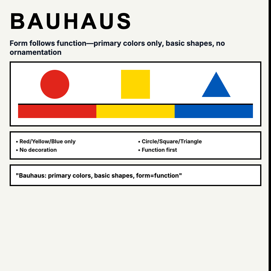
What is Bauhaus Design?
Bauhaus Design follows "form follows function"—geometric shapes (circles, squares, triangles), primary colors (red, yellow, blue), asymmetric composition, and sans-serif typography. Rooted in 1920s modernism but influences contemporary digital design.
When Should You Use This?
Use Bauhaus for design agencies, art galleries, architecture firms, or brands with modernist heritage. Works well for hero sections, posters, and marketing sites. Requires strong design skills to balance geometric elements.
Common Mistakes to Avoid
- •Superficial geometry—randomly placing circles/squares isn't Bauhaus; compositions must balance
- •Wrong colors—Bauhaus uses primary colors (RYB) + black; avoid pastels or complex palettes
- •Poor functionality—Bauhaus is about function; decorative geometry that hinders usability fails the philosophy
- •Inconsistent grid—Bauhaus relies on underlying grid structure even with asymmetric layouts
- •Ignoring typography—sans-serif type is fundamental; Futura and Univers capture the aesthetic
Real-World Examples
- •Bauhaus Archive Museum—website uses geometric shapes and primary color blocks
- •Design studios—many use Bauhaus-inspired hero sections with bold geometry
- •Stripe Sessions—conference branding occasionally uses Bauhaus-style geometric layouts
- •Art gallery sites—Chelsea galleries often use modernist Bauhaus principles
Category
Aesthetic Design
Tags
bauhausgeometric-designprimary-colorsmodernismfunctionalism