What is Cash App Aesthetic?
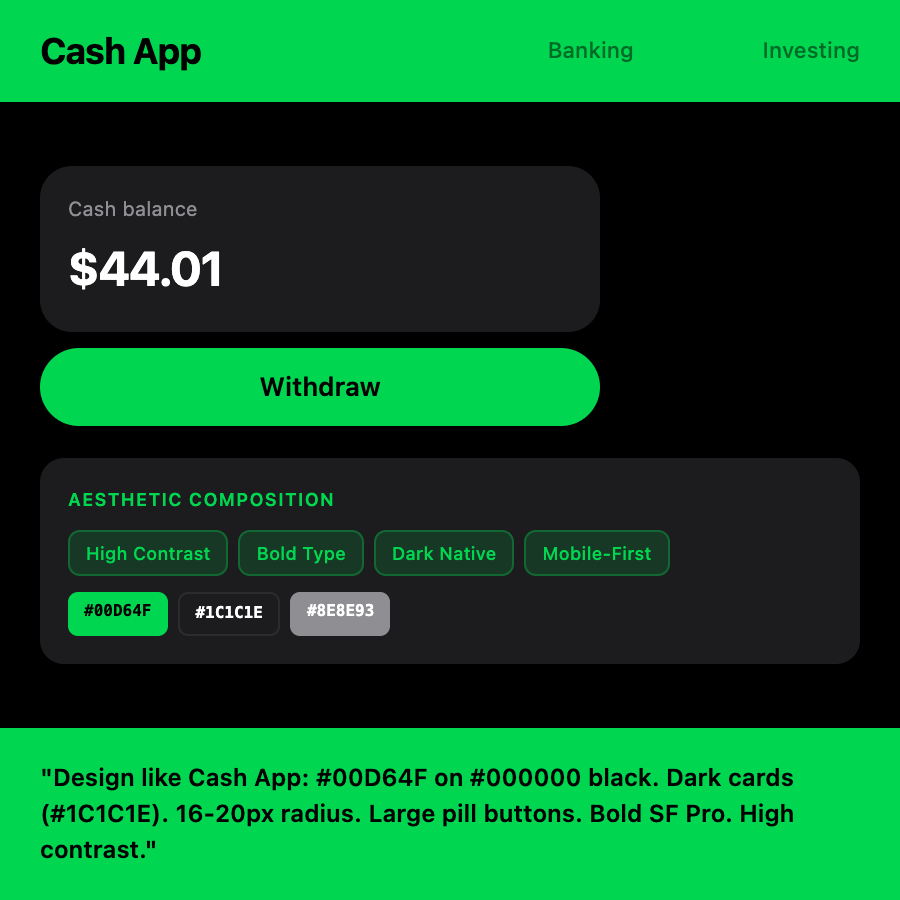
Cash App democratized money movement with fearlessly simple design. Neon green on black creates instant brand recognition and conveys speed/modernity. Every interaction is optimized for one-handed mobile use.
When Should You Use This?
Ideal for consumer fintech, peer-to-peer payments, mobile-first products, Gen Z brands, and crypto apps where bold branding and mobile optimization are essential.
Common Mistakes to Avoid
- •Using neon green for everything—Cash App uses it sparingly for CTAs
- •Desktop-first thinking—Their design is mobile-native
- •Small touch targets—Optimize for thumb reach zones
- •Overcomplicating flows—Cash App excels at one-tap actions
- •Ignoring dark mode—Black background is core to their identity
Real-World Examples
- •Peer-to-peer payment apps
- •Consumer fintech
- •Mobile crypto wallets
- •Gen Z financial products
- •Quick transaction tools
Category
Company Apps
Tags
fintechboldneonmobile-firsthigh-contrastconsumerminimalism