What is Dropdown?
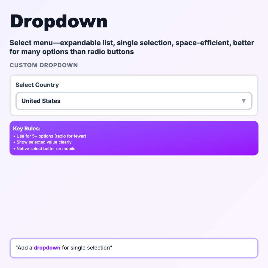
Dropdowns (Select Menus) let users pick one option from a collapsible list. Saves space by hiding options until clicked. Common for countries, states, categories, time zones—anything with >7 predetermined options. Desktop pattern—consider alternatives on mobile (bottom sheet, native picker).
When Should You Use This?
Use dropdowns for 7-15 mutually exclusive options where space is limited: countries, states, categories, sorting options. For 2-6 options use radio buttons (shows all choices). For >15 options use autocomplete (searchable). For mobile, use native select or bottom sheet for better UX.
Common Mistakes to Avoid
- •Too few options—2-6 options should be radio buttons (all visible at once)
- •Too many options—>15 options needs search; use autocomplete/combobox
- •No default selection—dropdowns should show a default or "Select..." placeholder
- •Poor mobile UX—custom dropdowns often break on mobile; use native select when possible
- •Nested dropdowns—confusing to navigate; flatten hierarchy or use cascading selects
Real-World Examples
- •Stripe—country selector with autocomplete for long list
- •Linear—status dropdown with color-coded options
- •GitHub—branch selector dropdown with recent and all branches
- •Notion—database property type selector (text, number, date, etc.)
Category
Form Patterns
Tags
dropdownselect-menuselect-inputdropdown-menuform-pattern