What is Empty State?
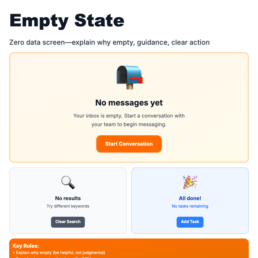
Empty States appear when there's no content to display—new account, cleared inbox, no search results. Instead of blank space, show helpful message, illustration, and action (Create, Import, Learn). Opportunity to guide users and reduce friction. First impressions for new users.
When Should You Use This?
Use empty states for lists, tables, search results, or any container that might be empty. Include: illustration/icon, clear message explaining why it's empty, primary action (Create, Import, Upload), optional secondary actions or tips. Make it friendly and helpful, not sad. New users see empty states first—make them welcoming.
Common Mistakes to Avoid
- •Sad/negative tone—"Nothing here" is depressing; try "Ready to create your first project?"
- •No action—empty state without CTA is dead end; always provide next step
- •Same message everywhere—new user vs. filtered-to-zero need different messages
- •Overly clever—illustration should clarify, not confuse; simple > clever
- •Forgetting search/filters—"No results" should explain filters are active, offer to clear them
Real-World Examples
- •Linear—"No issues yet" with friendly illustration, "Create your first issue" button
- •Notion—"Start writing..." in empty page, gentle onboarding
- •GitHub—empty repo with quick start guide and clone instructions
- •Stripe—empty dashboard with "Test mode" toggle and sample data option
Category
Feedback Patterns
Tags
empty-stateno-contentblank-slatezero-stateui-pattern