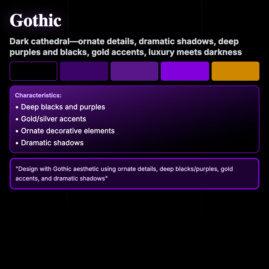
What is Gothic Design?
Gothic Design draws from Victorian and medieval aesthetics—dark color palettes (blacks, deep purples, crimsons), ornamental details, dramatic serif typography, mysterious atmospheres, and romantic darkness. Creates moody, dramatic, sophisticated feel.
When Should You Use This?
Use gothic for luxury brands with dark edge, music (metal, goth), fashion, horror/dark fantasy content, or products targeting gothic subculture. Works for brands wanting dramatic, romantic, or mysterious positioning.
Common Mistakes to Avoid
- •Too decorative—gothic should be sophisticated, not costume-y; restraint is key
- •Poor legibility—ornamental type must still be readable; use for headlines only
- •Wrong tone—gothic is romantic darkness, not just black; needs mood and atmosphere
- •Missing details—gothic relies on subtle ornamental details; plain black isn't gothic
- •Overuse—entire gothic UIs are overwhelming; use for brand moments and accents
Real-World Examples
- •Alexander McQueen—fashion brand uses gothic aesthetics for dramatic luxury
- •Metal band sites—many use gothic typography and dark aesthetics
- •Vampire fiction—book sites and games use gothic for appropriate mood
- •Luxury watches—some brands use gothic elements for heritage and drama
Category
Aesthetic Design
Tags
gothicdark-aestheticvictorianornamentaldramatic