What is Hover States?
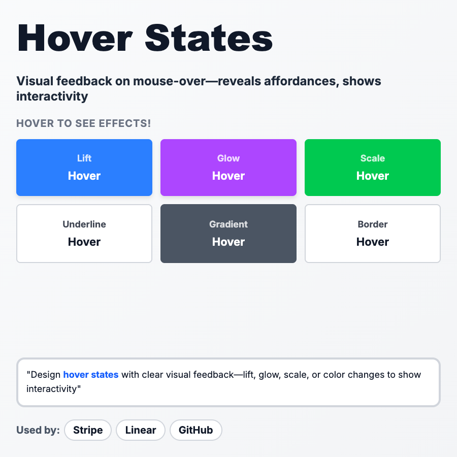
Hover States are visual changes that happen when you mouse over an interactive element (button, link, card). Signals "this is clickable" and provides instant feedback. Common effects: color change, underline, shadow, scale, brightness. Essential for desktop UX, but remember—hover doesn't exist on mobile.
When Should You Use This?
Add hover states to all interactive elements on desktop: buttons, links, cards, icons, form inputs. Make clickable things obvious before users click. Use subtle effects (color shift, opacity change) for most cases, bolder effects (scale, shadow) for primary actions. Always provide non-hover affordances too (cursor: pointer, button styling) since mobile doesn't have hover.
Common Mistakes to Avoid
- •Relying on hover for mobile—doesn't exist; use other affordances (button styling, icons)
- •Too subtle—if users don't notice the hover, it's useless; make it obvious
- •Inconsistent—all buttons should have similar hover behavior across your app
- •No transition—instant changes feel jarring; use smooth CSS transitions (200-300ms)
- •Hover on non-clickable elements—confuses users; only hover on interactive elements
Real-World Examples
- •Linear—buttons scale up slightly and change color on hover, feels premium
- •GitHub—underlines links, changes button background, subtle and consistent
- •Stripe—cards lift with shadow on hover, signals they're clickable
- •Notion—rows highlight on hover in tables/lists, shows what you're about to select
Category
Interaction Patterns
Tags
hover-stateshover-effectsinteractive-feedbackdesktop-uxcss