What is Input Field?
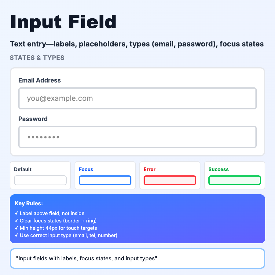
Input Fields are text boxes where users type information—name, email, password, search queries. The most fundamental form element. Includes label, placeholder, input area, validation state, and helper text. Critical to get right since forms are friction points.
When Should You Use This?
Use input fields for freeform text entry: names, emails, messages, search, passwords, URLs, phone numbers. Always include clear labels (not just placeholders), use appropriate input types (email, tel, url for mobile keyboards), validate inline when possible, show errors near the field. Keep forms short—every field reduces completion rate.
Common Mistakes to Avoid
- •Placeholder as label—placeholders disappear when typing; use persistent labels above/beside input
- •No input type—use type="email", type="tel" to trigger correct mobile keyboard
- •Validating too early—wait until blur or submit to show errors; don't yell while user is typing
- •Too small touch targets—inputs need 44×44px minimum for mobile; add padding
- •No error recovery—show exactly what's wrong and how to fix it, not just "Invalid input"
Real-World Examples
- •Linear—clean input fields with floating labels, inline validation, autofocus on new issue
- •Stripe—credit card input with real-time formatting, card type detection
- •Google—search input with autocomplete, recent searches, suggestions
- •Notion—inline inputs for page titles, seamless editing experience
Category
Form Patterns
Tags
input-fieldtext-inputformtext-boxui-pattern