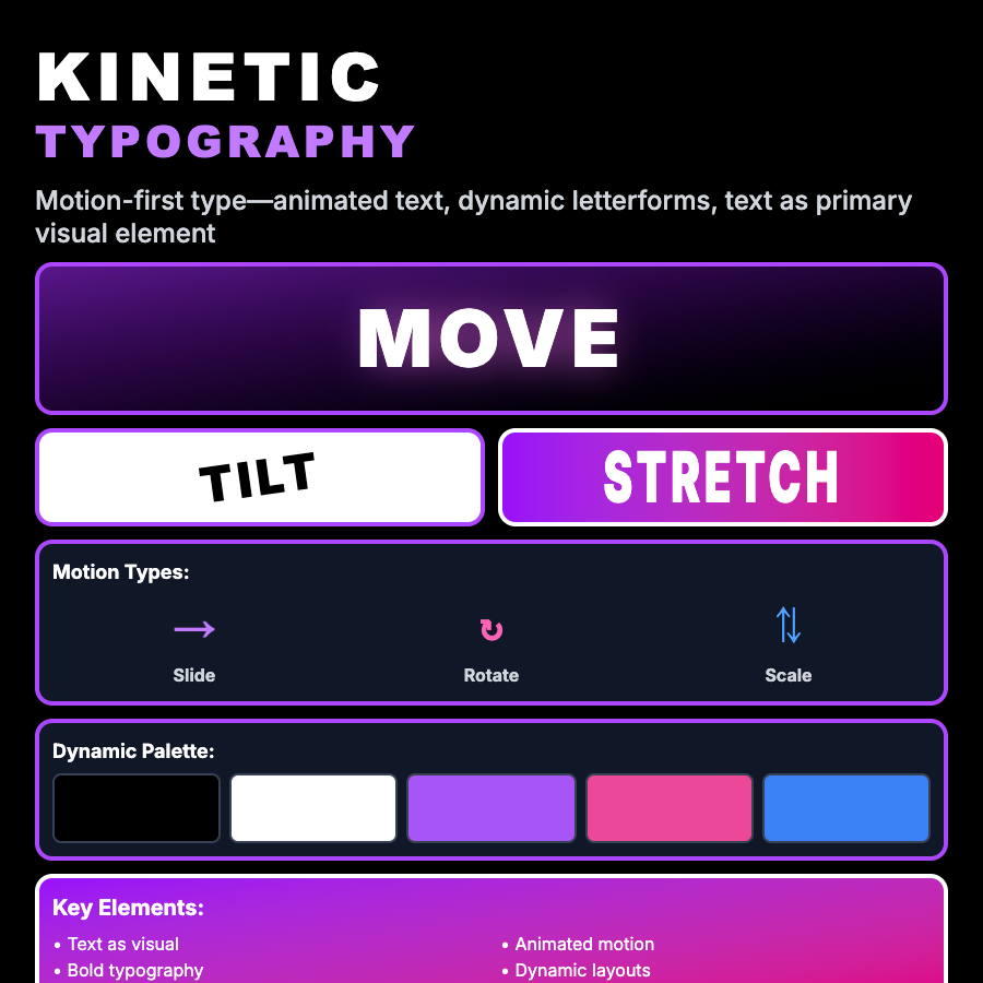
What is Kinetic Typography Design?
Kinetic Typography Design brings type to life through motion—animated letterforms, text that responds to interaction, expressive movement, and typographic storytelling. Uses animation to enhance meaning, create emotion, and capture attention.
When Should You Use This?
Use kinetic typography for video content, hero sections, product launches, creative agencies, or moments needing dramatic emphasis. Works well for products where motion adds meaning. Requires motion design skills.
Common Mistakes to Avoid
- •Motion for sake of motion—animation should enhance meaning, not distract
- •Too much movement—constant motion is exhausting; use strategically
- •Poor timing—kinetic typography lives in precise timing; rushed or slow timing fails
- •Ignoring accessibility—provide reduced-motion alternatives for users with motion sensitivity
- •Illegibility—text must remain readable; overly complex animation destroys legibility
Real-World Examples
- •Apple product launches—uses kinetic typography for dramatic product reveals
- •Movie title sequences—films use kinetic type to set tone and credit cast
- •Music videos—typography often dances with music for lyric videos
- •Agency portfolios—creative studios showcase kinetic typography skills in reels
Category
Aesthetic Design
Tags
kinetic-typographymotion-designanimated-textmoving-typeexpressive