What is Memphis Design?
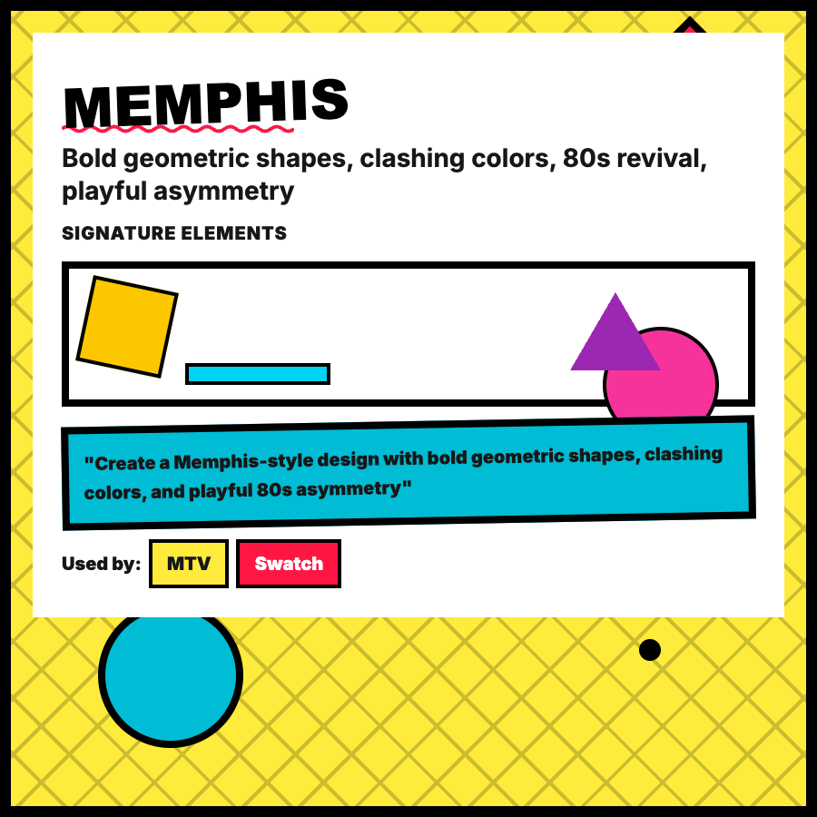
Memphis Design is a postmodern style from 1980s Italy featuring bold geometric shapes, clashing color combinations, squiggly lines, dots, checkerboards, and asymmetric compositions. Rejects minimalism in favor of playful, energetic visual chaos.
When Should You Use This?
Use Memphis for creative agencies, event sites, youth-focused brands, or when targeting gen-z/millennial audiences. Works well for hero sections, illustrations, and marketing materials. Not suitable for serious B2B or accessibility-focused products.
Common Mistakes to Avoid
- •Visual chaos—Memphis is bold but needs structure; use grids to organize chaotic elements
- •Poor readability—busy patterns behind text kill legibility; keep type areas clean
- •Overuse—entire Memphis sites are exhausting; use for accents and hero sections only
- •Wrong audience—corporate/professional audiences may find Memphis unprofessional
- •Ignoring accessibility—clashing colors often have poor contrast; test with accessibility tools
Real-World Examples
- •Mailchimp—marketing site uses Memphis-inspired patterns and bold geometric shapes
- •Spotify—playlists and campaign pages occasionally use Memphis-style graphics
- •Slack—brand refresh incorporated playful geometric patterns inspired by Memphis
- •Conference websites—SXSW and similar events use bold Memphis aesthetics
Category
Aesthetic Design
Tags
memphis-designgeometric-patternsbold-colorspostmodern80s-aesthetic