What is Mercury Aesthetic?
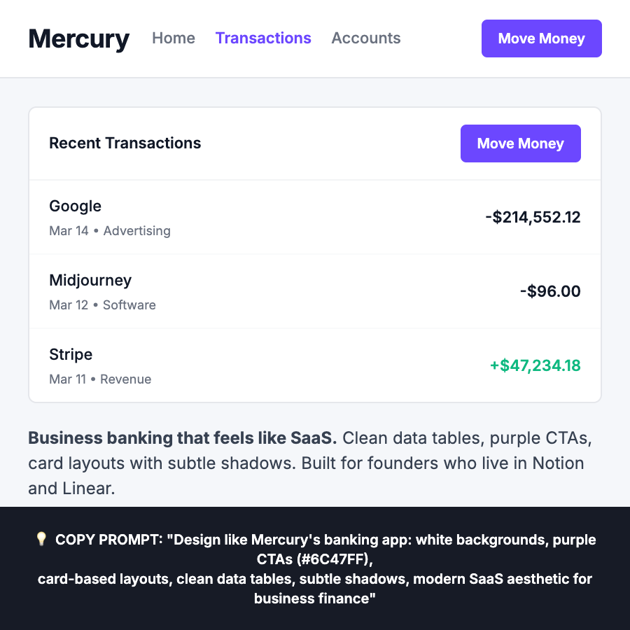
Mercury's business banking app feels like modern SaaS, not traditional banking. Clean white backgrounds, purple CTAs, card-based layouts with subtle shadows, and data-dense tables with perfect spacing. Financial metrics displayed like analytics dashboards—built for startup founders who live in Notion and Linear.
When Should You Use This?
Ideal for business banking apps, startup finance dashboards, B2B fintech tools, transaction-heavy interfaces, and account management UIs.
Common Mistakes to Avoid
- •Traditional banking vibes—Mercury feels like Notion, not Bank of America
- •Dark mode by default—Mercury uses clean white backgrounds
- •Consumer-facing language—Speak to business owners, not consumers
- •Missing card layouts—Mercury uses cards for account sections and transactions
- •Ignoring data tables—Clean, well-spaced tables are core to the aesthetic
Real-World Examples
- •Business banking apps
- •Startup finance dashboards
- •B2B payment tools
- •Account management interfaces
- •Transaction history UIs
Category
Company Apps
Tags
fintechbankingb2bpurplecard-basedsaas-styledata-tablesdashboards