What is Miami Vice Design?
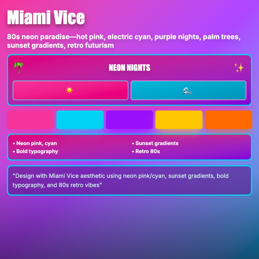
Miami Vice Design captures 80s Florida coastal aesthetics—hot pink and turquoise color combinations, palm trees, sunset gradients, art deco influence, and sun-soaked neon vibes. Named after the iconic TV show, embodies tropical 80s excess.
When Should You Use This?
Use Miami Vice for tropical brands, summer campaigns, music (especially electronic/tropical house), fashion, or products targeting upbeat, party-oriented audiences. Works well for limited-time campaigns and seasonal promotions.
Common Mistakes to Avoid
- •Wrong colors—Miami Vice is specifically hot pink + turquoise; other combinations miss the aesthetic
- •Too literal—don't need palm trees everywhere; color palette evokes the vibe
- •Missing 80s context—Miami Vice is 80s-specific; mixing with other eras dilutes it
- •Overuse—intense color combination is exhausting; use for accents and campaigns
- •Wrong season—Miami Vice works for summer; feels out of place in winter
Real-World Examples
- •Spring break campaigns—brands use Miami Vice for tropical, party vibes
- •Music festivals—Coachella and similar occasionally use Miami Vice aesthetics
- •Clothing brands—summer collections often adopt hot pink/turquoise combinations
- •Tropical drinks—beverage brands use Miami Vice for fun, coastal positioning
Category
Aesthetic Design
Tags
miami-vicetropical-80shot-pink-turquoisecoastalneon-tropical