What is Retro Design?
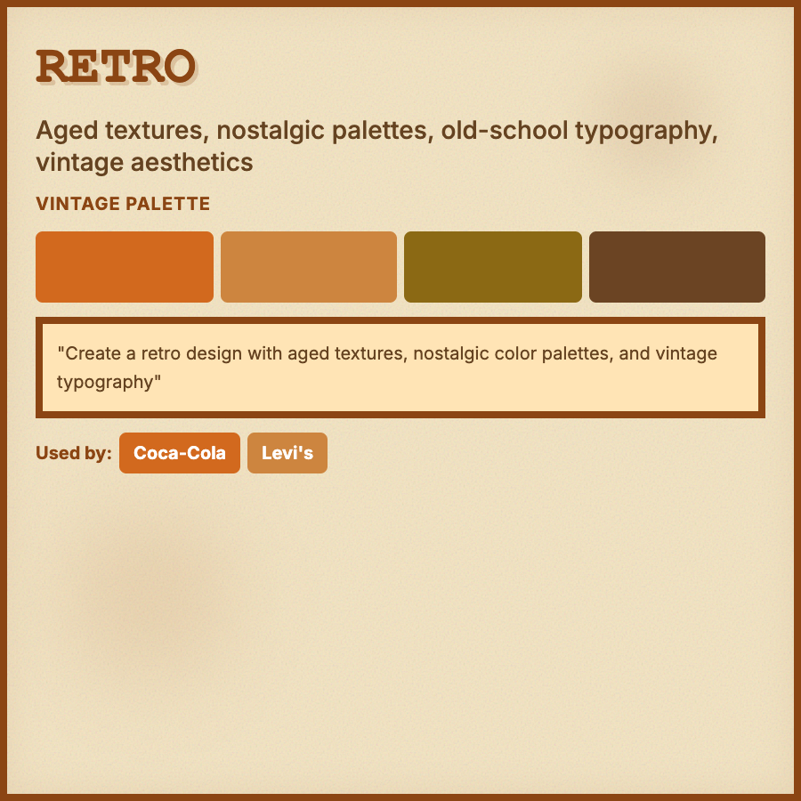
Retro Design draws from 1960s-1980s aesthetics—warm color palettes (oranges, browns, yellows), rounded typography, geometric patterns, and nostalgic elements. Creates emotional connection through familiarity and comfort of past eras.
When Should You Use This?
Use retro design for lifestyle brands, music apps, vintage shops, food/beverage brands, or products targeting millennials who grew up with these aesthetics. Works well for brands emphasizing authenticity and craftsmanship.
Common Mistakes to Avoid
- •Generic vintage—research specific eras; 60s, 70s, and 80s have distinct visual languages
- •Dated execution—retro should feel nostalgic, not old; add modern UX patterns
- •Poor legibility—vintage fonts can be hard to read; use for headlines only
- •Inconsistent period—mixing 60s and 80s elements creates confusion; pick an era
- •Overuse of effects—too many gradients/textures makes designs feel dated rather than retro
Real-World Examples
- •Spotify—70s Wrapped campaign used authentic retro colors and typography
- •Casper—mattress brand uses warm retro colors and rounded shapes in illustrations
- •Vinyl record shops—many use 70s-inspired typography and warm color palettes
- •Burger restaurants—Five Guys and similar use retro diner aesthetics
Category
Aesthetic Design
Tags
retrovintagenostalgic70s-aestheticthrowback