What is Sticky Header?
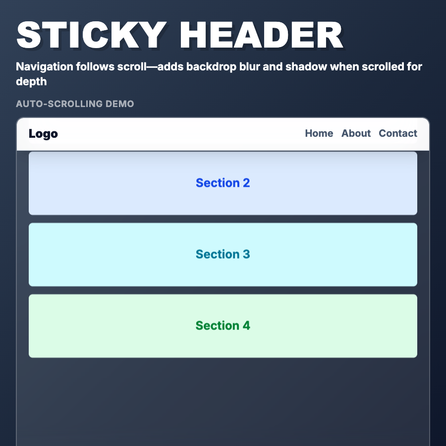
Sticky Header remains fixed at top of viewport while scrolling, keeping navigation always accessible. Uses CSS position: sticky or position: fixed. Often shrinks or changes appearance on scroll for space efficiency. Essential UX pattern for long pages.
When Should You Use This?
Use sticky headers for all multi-section pages where users need to navigate between sections. Essential for documentation, long-form content, and marketing sites. Consider hiding on scroll down, showing on scroll up for more screen space.
Common Mistakes to Avoid
- •Too tall—sticky headers steal vertical space; keep compact (60px max) or shrink on scroll
- •Always visible—consider hiding on scroll down, revealing on scroll up (headroom pattern)
- •Missing scroll indicator—users lose sense of page position; add subtle progress indicator
- •Wrong z-index—ensure header stays above content but doesn't block modals
- •Mobile space hog—large sticky headers on mobile waste precious screen real estate
Real-World Examples
- •Documentation—Stripe, Tailwind docs use sticky headers for section navigation
- •Marketing sites—most modern sites use sticky navigation for accessibility
- •Medium—hides header on scroll down, shows on scroll up to maximize reading space
- •Apple—product pages use shrinking sticky headers that compact on scroll
Category
Visual Effects
Tags
sticky-headerfixed-navigationpersistent-navscroll-headerux-pattern