What is Y2K Design?
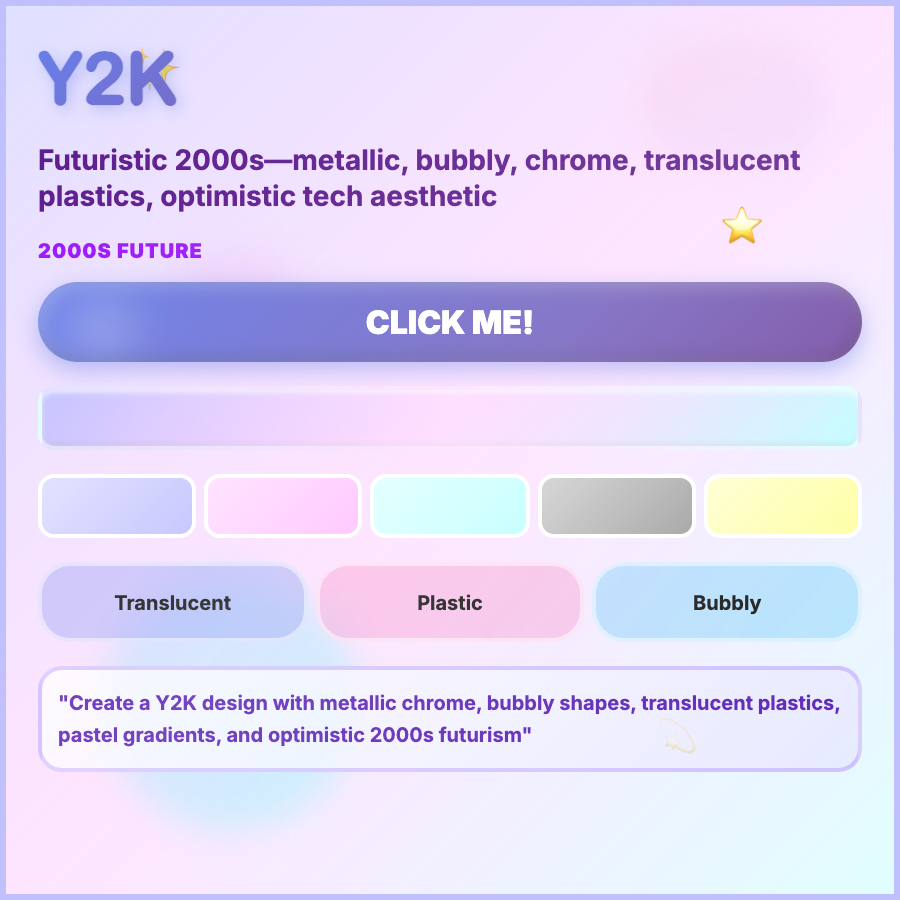
Y2K Design captures late 90s/early 2000s optimistic tech aesthetic—chrome effects, metallic finishes, bubbly/blob shapes, bright contrasting colors, pixelated elements, and digital-native imagery. Reflects turn-of-millennium techno-optimism.
When Should You Use This?
Use Y2K for gen-z focused brands, fashion, beauty, social apps, or products targeting 90s/2000s nostalgia. Works for playful, youth-oriented products. Currently having major resurgence in popularity.
Common Mistakes to Avoid
- •Wrong era—Y2K is specifically 1998-2004; don't mix with 80s or modern elements
- •Missing chrome—metallic/glossy effects are essential; flat Y2K feels incomplete
- •Too serious—Y2K is playful and optimistic; overly polished execution misses the vibe
- •Poor accessibility—bright contrasting colors must still meet contrast ratios
- •Ignoring context—Y2K works for youth/fashion brands but feels wrong for B2B
Real-World Examples
- •Depop—fashion resale app uses Y2K chrome effects and bubbly shapes
- •BeReal—social app incorporates Y2K-inspired playful UI elements
- •Fashion brands—Jacquemus and Miaou use Y2K aesthetics in digital presence
- •Music artists—Dua Lipa and similar pop artists use Y2K in album art and websites
Category
Aesthetic Design
Tags
y2kchrome-effect2000s-aestheticmillenniumbubbly