What is Alert Banner?
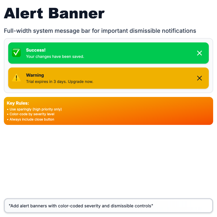
Alert Banners are persistent messages displayed at the top (or inline) to communicate important information, warnings, or errors. Don't auto-dismiss—require user acknowledgment or action. Color-coded: red (error), yellow (warning), blue (info), green (success). More prominent than toasts, less intrusive than modals.
When Should You Use This?
Use alert banners for important, persistent messages: errors that need attention, system-wide warnings (maintenance), important updates, payment issues, verification prompts. Place at top of page or inline near relevant content. Provide clear action (Fix, Learn More, Dismiss). Use color and icon to indicate severity. Dismissible if not critical.
Common Mistakes to Avoid
- •Too many banners—multiple banners stack and overwhelm; limit to 1-2 critical messages
- •Wrong severity color—payment failure is error (red), not warning (yellow)
- •No action—"Your trial expires soon" needs "Upgrade" button, not just information
- •Blocking content—banners should push content down, not cover it
- •Can't dismiss—if message is informational, let users dismiss it
Real-World Examples
- •GitHub—yellow banner for unverified email, persists until verified
- •Stripe—red banner for payment failures with "Update card" action
- •Linear—blue banner for new feature announcements, dismissible
- •Notion—yellow banner for "Workspace storage almost full" with upgrade link
Category
Feedback Patterns
Tags
alert-bannernotification-bannerwarningsystem-messageui-pattern