What is Toast Notification?
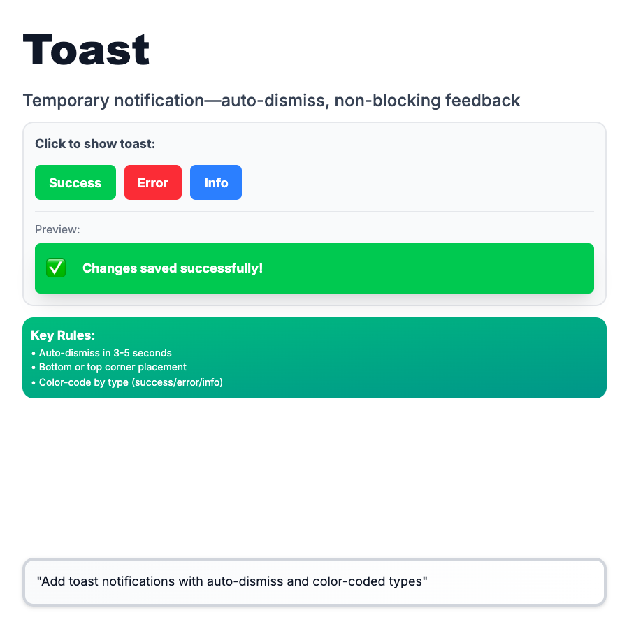
Toast Notifications (Snackbars) are brief, temporary messages that appear at the edge of the screen to confirm actions or provide lightweight feedback. Auto-dismiss after 3-5 seconds. Non-blocking—users can continue working while toast is visible. Common for "Saved," "Copied," "Deleted" confirmations.
When Should You Use This?
Use toasts for non-critical, transient feedback: action confirmations (saved, deleted, copied), success states, non-urgent warnings. Don't use for errors that require action, critical information, or long messages. Place at bottom or top of screen. Keep text short (1 line). Auto-dismiss or provide dismiss button. Don't stack too many toasts.
Common Mistakes to Avoid
- •Using for errors—errors need visibility and action; use alert banner or modal instead
- •Too many toasts—stacking 5 toasts is chaos; queue or deduplicate similar messages
- •Too fast/slow—3-5 seconds is sweet spot; <2s users miss it, >7s feels stuck
- •Important info in toast—if users need to reference it, use persistent UI element
- •No dismiss button—users should be able to close toasts manually
Real-World Examples
- •Linear—"Issue created" toast with undo button, auto-dismisses in 4s
- •GitHub—"Copied!" toast when copying code snippets
- •Slack—"Message sent" confirmation, bottom-left corner
- •Notion—"Page published" toast with link to view published page
Category
Feedback Patterns
Tags
toastnotificationsnackbarfeedbackui-pattern