What is Checkbox?
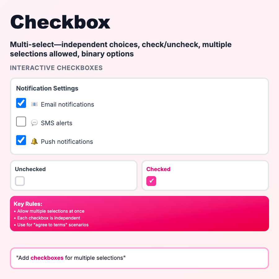
Checkboxes let users select zero, one, or multiple options from a list. Each checkbox is independent—checking one doesn't affect others. Common for accepting terms, selecting features, filters, or any multi-select scenario. Square shape (vs. radio's circle) signals multiple selections allowed.
When Should You Use This?
Use checkboxes when users can select multiple options (or none): filters (price ranges, categories), feature selection (notification settings), terms acceptance, task completion. Use radio buttons when only one option is allowed. Use toggle switches for binary on/off states. Keep checkbox lists short (<7 items) or make scrollable.
Common Mistakes to Avoid
- •Using for single selection—if only one choice allowed, use radio buttons
- •Tiny touch targets—checkboxes need 44×44px minimum clickable area; increase label padding
- •Label not clickable—entire label should toggle checkbox, not just the box itself
- •No indeterminate state—when some sub-items are checked, parent checkbox should show dash (indeterminate)
- •Poor visual hierarchy—group related checkboxes with spacing/indentation
Real-World Examples
- •Linear—checkbox filters for status, assignee, labels (multi-select)
- •Gmail—checkboxes to select multiple emails for bulk actions
- •Notion—task lists with checkboxes, strike-through on completion
- •Stripe—feature selection in pricing configurator
Category
Form Patterns
Tags
checkboxmulti-selectform-inputcheckbox-listui-pattern