What is Toggle Switch?
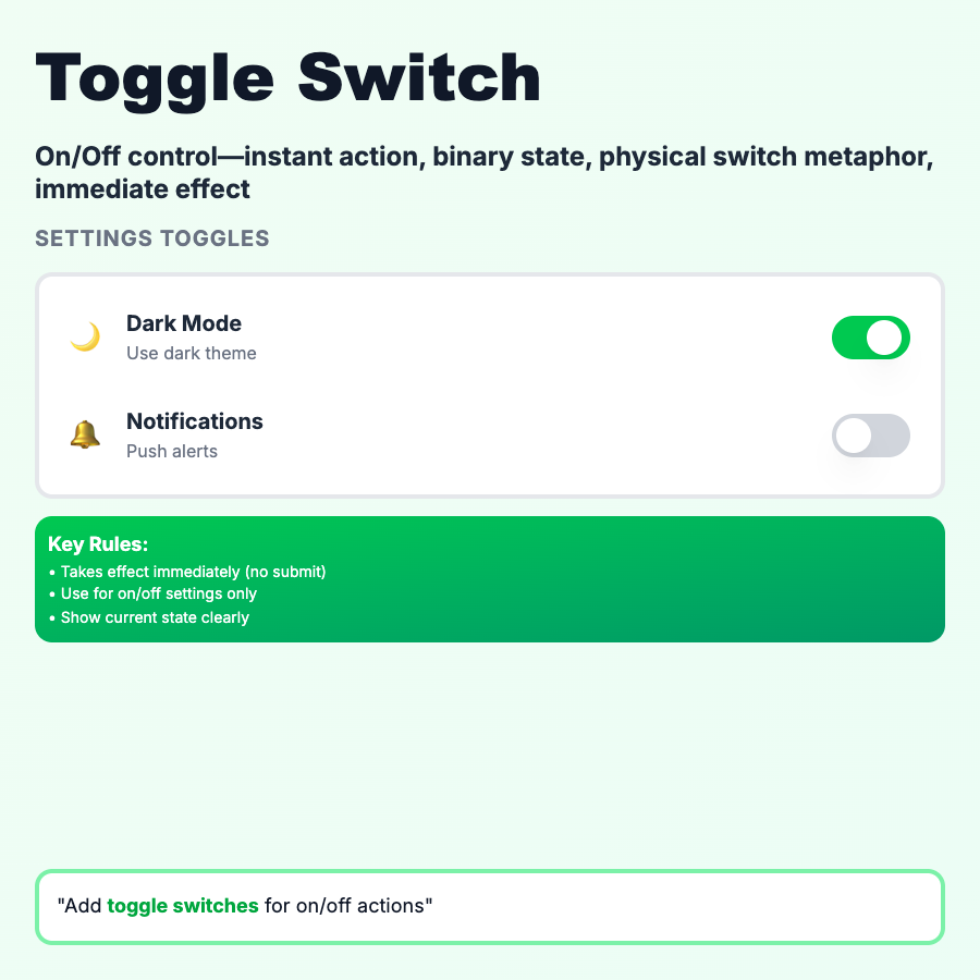
Toggle Switches represent binary on/off states with immediate effect—no submit button needed. Sliding animation from off (left/gray) to on (right/colored) provides clear feedback. Like a physical light switch. Use for settings, enabling features, or any true/false choice that takes effect immediately.
When Should You Use This?
Use toggles for binary on/off settings that apply immediately: notification preferences, feature flags, public/private visibility, dark mode. Don't use in forms that require submit—use checkboxes instead. Toggle should take effect on click, not on form submission. Label should describe the setting, not the action ("Email notifications" not "Enable email notifications").
Common Mistakes to Avoid
- •Using in forms—toggles imply immediate effect; if form needs submit, use checkbox
- •Ambiguous labels—"Notifications" is clear, "Enable notifications?" is confusing
- •No confirmation for dangerous actions—deleting data, public visibility need confirmation
- •Desktop-only design—toggles must work on mobile; ensure 44×44px touch target
- •Off state unclear—use color (gray=off, blue=on) and position (left=off, right=on)
Real-World Examples
- •iOS Settings—toggles for every on/off preference, immediate effect
- •Linear—toggle issue privacy (public/private) or notifications per project
- •Notion—toggle page visibility, comments, backlinks in page settings
- •GitHub—toggle repository visibility (public/private), immediately applied
Category
Form Patterns
Tags
toggle-switchswitchon-off-togglebinary-inputui-pattern