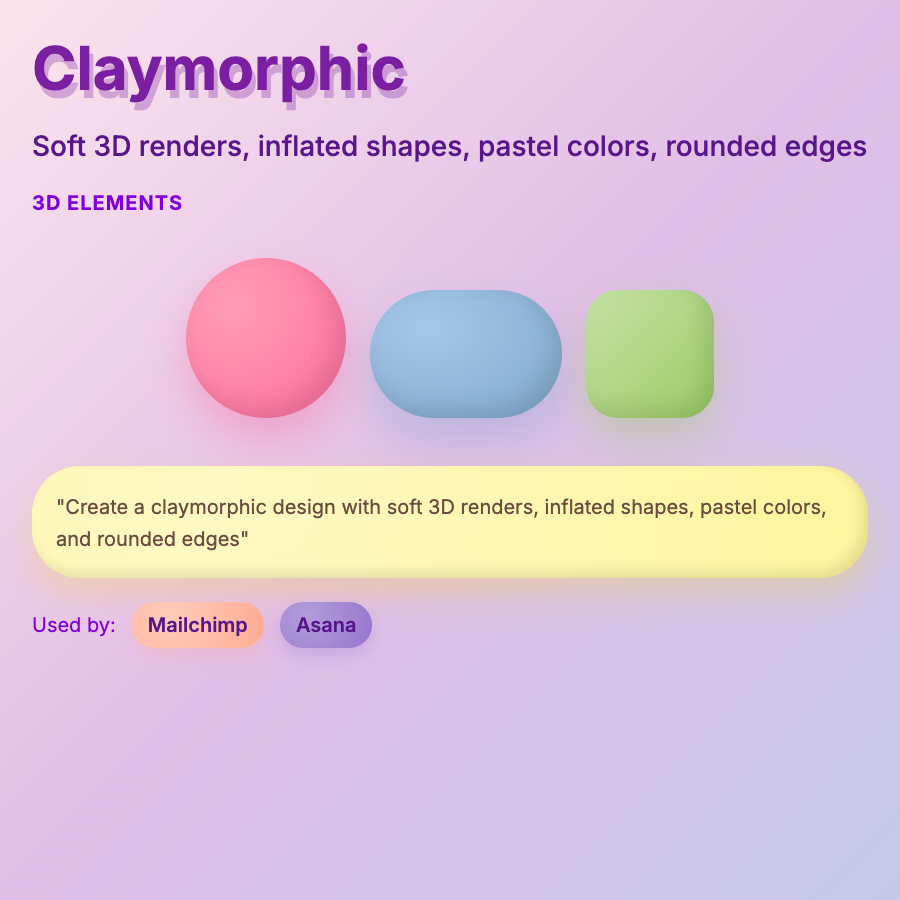
What is Claymorphic Design?
Claymorphic Design features soft, inflated 3D objects that resemble clay or Play-Doh—rounded shapes, matte textures, pastel colors, and playful proportions. Creates friendly, approachable, tactile aesthetic. Evolution of flat design with 3D depth.
When Should You Use This?
Use claymorphism for consumer apps, children's products, playful brands, creative tools, or products targeting younger/casual audiences. Works well for illustrations and hero sections. Popular in mobile app design.
Common Mistakes to Avoid
- •Too literal—clay aesthetic should feel digital, not photorealistic clay renders
- •Wrong colors—claymorphism typically uses soft pastels; harsh colors break the vibe
- •Missing depth—elements should feel inflated/3D; flat shapes with clay texture fail
- •Overuse—entire claymorphic UIs are exhausting; use for illustrations and accents
- •Performance—3D rendering can be heavy; optimize models or use illustrated approach
Real-World Examples
- •Instagram—occasionally uses claymorphic illustrations in campaigns
- •Duolingo—language app uses clay-like 3D characters and elements
- •Mobile games—many casual games use claymorphic aesthetic for friendly feel
- •SaaS onboarding—products use claymorphic illustrations to soften technical products
Category
Aesthetic Design
Tags
claymorphismclay-3dinflated-shapessoft-3dplayful