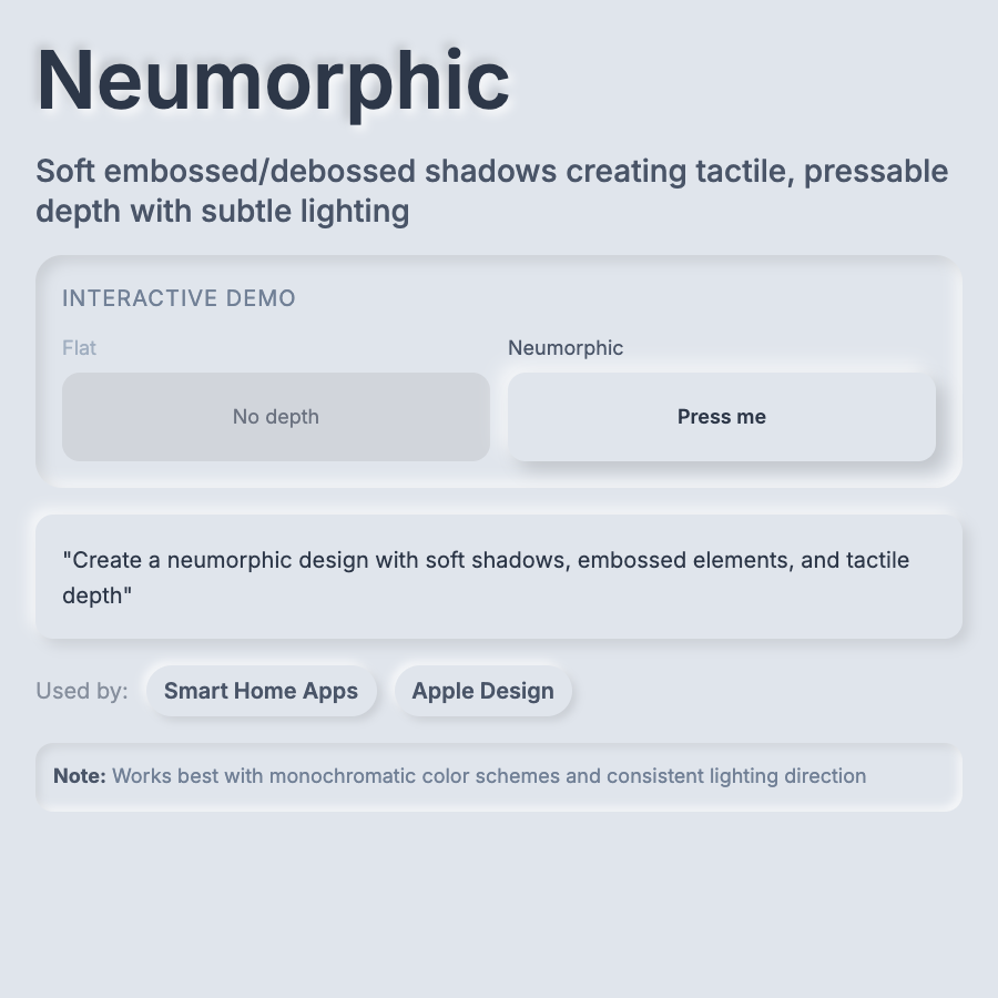
What is Neumorphic Design?
Neumorphic Design (soft UI) creates subtle 3D effects using inner and outer shadows on same-colored backgrounds. Elements appear slightly raised or pressed into the interface. Requires precise shadow control and low-contrast color schemes. A modern evolution of skeuomorphism.
When Should You Use This?
Use neumorphism for music players, smart home controls, calculator apps, or design showcases. Best for contained UI elements like buttons and cards rather than entire layouts. Works well in dark mode. Not suitable for accessibility-focused products.
Common Mistakes to Avoid
- •Poor accessibility—low contrast fails WCAG standards; add color variations or abandon neumorphism
- •Overuse—entire neumorphic UIs are overwhelming; use for accents and key interactions
- •Wrong backgrounds—needs solid, mid-tone backgrounds; doesn't work on white or black
- •Inconsistent light source—all shadows must assume same light direction (usually top-left)
- •Ignoring mobile—subtle shadows are hard to see on small screens in bright light
Real-World Examples
- •Music apps—many iOS music players use neumorphic controls for playback buttons
- •Smart home apps—thermostat and light controls often use soft UI for tactile feel
- •Dribbble designs—neumorphism exploded on design portfolios in 2020 (more showcase than production)
- •Calculator apps—neumorphic buttons work well for simple, button-heavy interfaces
Category
Aesthetic Design
Tags
neumorphismsoft-uisubtle-3dlow-contrasttactile-design