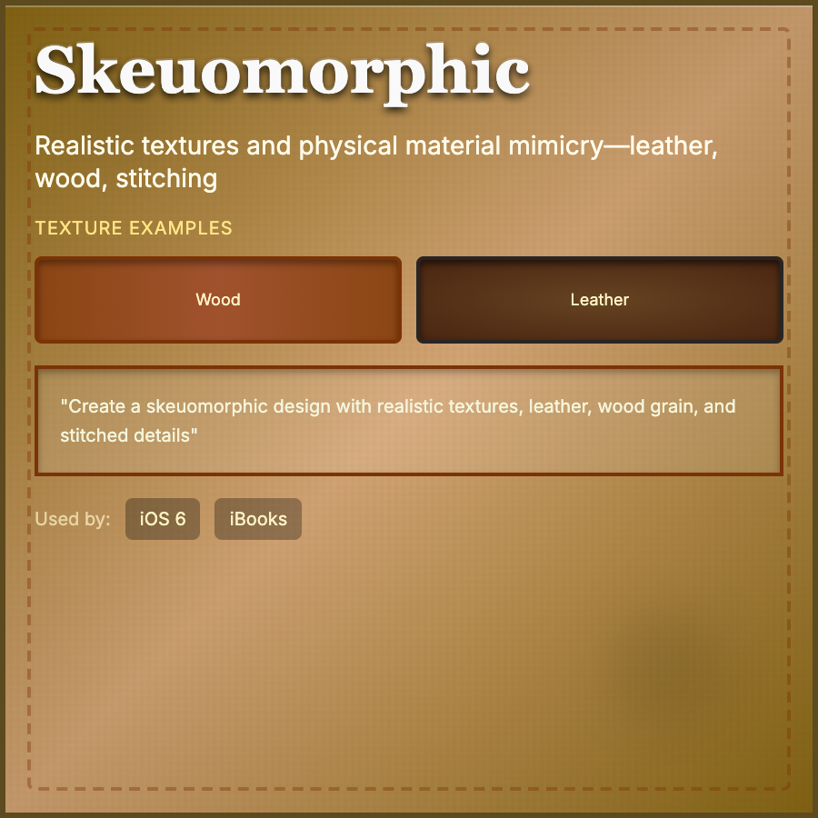
What is Skeuomorphic Design?
Skeuomorphic Design mimics real-world materials and objects in digital interfaces. Think leather textures, wood grain, stitched leather, page-turn animations, and buttons that look physically pressable. Dominated early iOS design before flat design took over.
When Should You Use This?
Use skeuomorphism for music production software, creative tools, games, or apps targeting older demographics who need familiar metaphors. Works well for single-purpose apps that mimic physical objects (e.g., a guitar tuner app).
Common Mistakes to Avoid
- •Dated execution—heavy skeuomorphism feels 2010; if using, make it intentional and modern
- •Overcomplicating simple UIs—don't add leather texture to a CRUD app; it adds no value
- •Poor scalability—detailed textures and shadows increase file sizes and slow load times
- •Inconsistent metaphors—if mimicking physical objects, behavior must match expectations
- •Ignoring accessibility—textured backgrounds can reduce text legibility
Real-World Examples
- •iOS 6 Notes—yellow legal pad with torn paper and marker felt font (classic skeuomorphism)
- •GarageBand—music software uses realistic instrument interfaces and studio equipment
- •Calculator apps—many still use button shadows and gradients for physical feel
- •Apple Books—page-turn animations and wood bookshelves (removed in iOS 7)
Category
Aesthetic Design
Tags
skeuomorphismrealistic-uitexturesphysical-metaphorsmaterial-design