What is Flat Design?
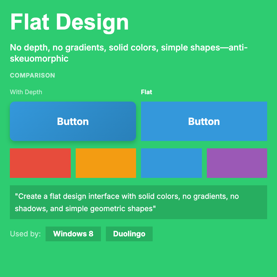
Flat Design rejects skeuomorphism's textures and shadows in favor of 2D, minimalist aesthetics. Uses solid colors, simple shapes, clean typography, no gradients or depth cues. Popularized by Windows Metro and iOS 7. Evolved into "Flat 2.0" with subtle shadows.
When Should You Use This?
Use flat design for modern web apps, mobile apps, dashboards, or any interface prioritizing content over decoration. Works well for B2C products, especially when paired with bold brand colors. Great for responsive design (scales easily).
Common Mistakes to Avoid
- •Too flat—removing all depth cues makes buttons look like labels; add subtle hover states
- •Poor affordances—users need to know what's clickable; use color, underlines, or subtle shadows
- •Boring execution—flat doesn't mean lifeless; use color, animation, and typography creatively
- •Inconsistent depths—decide on truly flat or "almost flat" (Flat 2.0) and stick to it
- •Ignoring hierarchy—without shadows, must use size, color, and spacing for visual hierarchy
Real-World Examples
- •Windows Metro—pioneered flat design with bold colors and typography-focused UI
- •iOS 7+—Apple's shift from skeuomorphism to flat design influenced entire industry
- •Google Material Design—started flat but evolved to include subtle shadows (Flat 2.0)
- •Dropbox—brand refresh used bold, flat illustration style and minimal UI
Category
Aesthetic Design
Tags
flat-design2d-uino-shadowsbold-colorsmodern-minimalism