What is Minimalist Design?
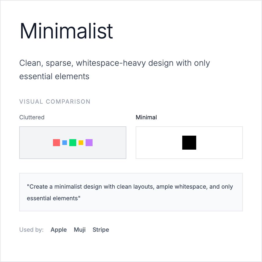
Minimalist Design strips away non-essential elements to focus on core content and functionality. It uses generous white space, limited color palettes (often 2-3 colors), simple typography, and clean layouts. The aesthetic prioritizes clarity and usability over decoration.
When Should You Use This?
Use minimalist design for B2B SaaS dashboards, productivity tools, content-focused sites (blogs, portfolios), luxury brand sites, or when targeting professional audiences. Works well when your product's value is in functionality rather than visual richness.
Common Mistakes to Avoid
- •Too minimal—removing necessary UI affordances; users need buttons to look clickable
- •Boring execution—minimalism isn't just white backgrounds; add subtle details
- •Poor hierarchy—without color/decoration, typography and spacing must create clear hierarchy
- •Inconsistent spacing—minimalism requires precise, systematic spacing (use 8px grid)
- •Ignoring usability—form over function; ensure interactive elements have clear hover/focus states
Real-World Examples
- •Apple—product pages use white space, system fonts, and restraint to let products shine
- •Linear—issue tracker with clean typography, limited color, and generous spacing
- •Stripe—documentation uses minimal style with clear hierarchy and subtle shadows
- •Notion—workspace UI combines minimalism with just enough visual detail for usability
Category
Aesthetic Design
Tags
minimalistclean-designwhite-spacesimple-uiless-is-more