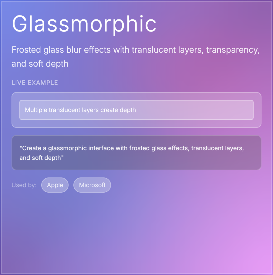
What is Glassmorphic Design?
Glassmorphic Design mimics frosted glass using backdrop blur, semi-transparency, subtle borders, and vibrant backgrounds. Elements appear to float above colorful backgrounds with a blurred-glass effect. Popularized by Apple's iOS and macOS design language.
When Should You Use This?
Use glassmorphism for hero sections, modal overlays, navigation bars, cards over colorful backgrounds, or music/media apps. Works well for consumer-facing products, especially on devices with good GPU performance. Avoid for text-heavy interfaces.
Common Mistakes to Avoid
- •Poor performance—backdrop-filter is GPU-intensive; use sparingly, especially on mobile
- •Illegible text—ensure sufficient contrast between glass and background (add subtle tints)
- •Overuse—too many glass elements create visual chaos; use for key focal points only
- •Missing fallbacks—older browsers don't support backdrop-filter; provide solid background fallback
- •Wrong backgrounds—glassmorphism needs colorful/vibrant backgrounds to shine; looks bad on white
Real-World Examples
- •macOS Big Sur—system UI uses glassmorphic sidebars and menus throughout
- •Apple Music—player controls use frosted glass over album art backgrounds
- •Windows 11—acrylic material creates glassmorphic effects in system UI
- •Stripe Connect—onboarding flows use subtle glassmorphic cards
Category
Aesthetic Design
Tags
glassmorphismfrosted-glassbackdrop-blurtranslucentmodern-ui