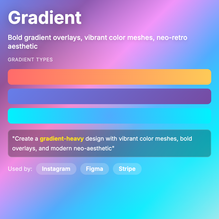
What is Gradient Design?
Gradient Design uses smooth transitions between colors—can be subtle (tonal gradients) or bold (multi-color transitions). Adds depth, dimension, and visual interest without heavy graphics. Resurgence from flat design era.
When Should You Use This?
Use gradients for backgrounds, buttons, illustrations, or brand elements. Works across most product types. Subtle gradients add polish to minimalist designs; bold gradients work for consumer/creative products. Very popular in modern web design.
Common Mistakes to Avoid
- •Too many colors—limit to 2-3 colors per gradient; more creates muddy middle tones
- •Wrong angle—consider gradient direction for readability (vertical often works best)
- •Banding—use enough color stops to prevent visible bands; dithering helps
- •Poor contrast—ensure text over gradients remains legible (use overlays or test contrast)
- •Overuse—gradients everywhere creates visual chaos; use intentionally
Real-World Examples
- •Instagram—iconic gradient logo and app used vibrant multi-color gradients
- •Stripe—uses subtle purple-to-blue gradients throughout brand and product
- •Asana—project management tool uses gradients for illustrations and brand elements
- •Linear—issue tracker uses subtle gradients for depth and visual interest
Category
Aesthetic Design
Tags
gradientcolor-transitionsombrecolor-blendsdepth