What is Cyberpunk Design?
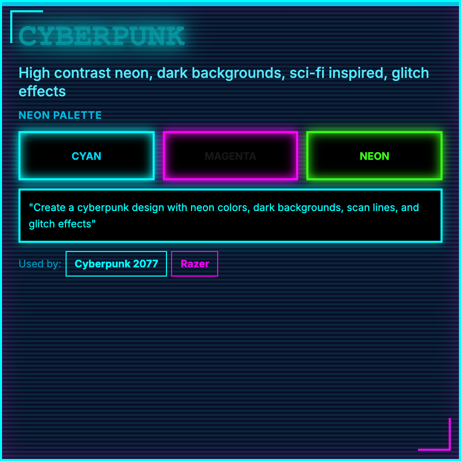
Cyberpunk Design merges high-tech with urban decay—neon colors (especially pink/cyan), glitch effects, HUD-style interfaces, dystopian imagery, and Japanese influence. Represents "high tech, low life" philosophy of cyberpunk fiction.
When Should You Use This?
Use cyberpunk for gaming, tech products with edgy positioning, crypto/web3, sci-fi content, or brands targeting tech-savvy younger audiences. Works for products embracing counter-culture or anti-establishment positioning.
Common Mistakes to Avoid
- •Too clean—cyberpunk needs grit and decay alongside tech; pristine execution feels wrong
- •Generic neon—cyberpunk neon has specific usage: signage, reflections, atmospheric lighting
- •Missing Asian influence—cyberpunk draws heavily from Japanese aesthetics and typography
- •Overuse of glitch—glitch should enhance mood, not obstruct readability
- •Wrong tone—cyberpunk is dystopian/noir, not optimistic sci-fi (that's retro-futurism)
Real-World Examples
- •Cyberpunk 2077—game exemplifies aesthetic with neon-lit dystopian Night City
- •Crypto platforms—many DeFi sites use cyberpunk aesthetics for edgy positioning
- •Blade Runner-inspired sites—tech products occasionally use cyberpunk for launches
- •Gaming peripherals—Razer and similar use cyberpunk-inspired neon and tech aesthetics
Category
Aesthetic Design
Tags
cyberpunkdystopianneon-techglitchfuture-noir