What is Fluid Typography?
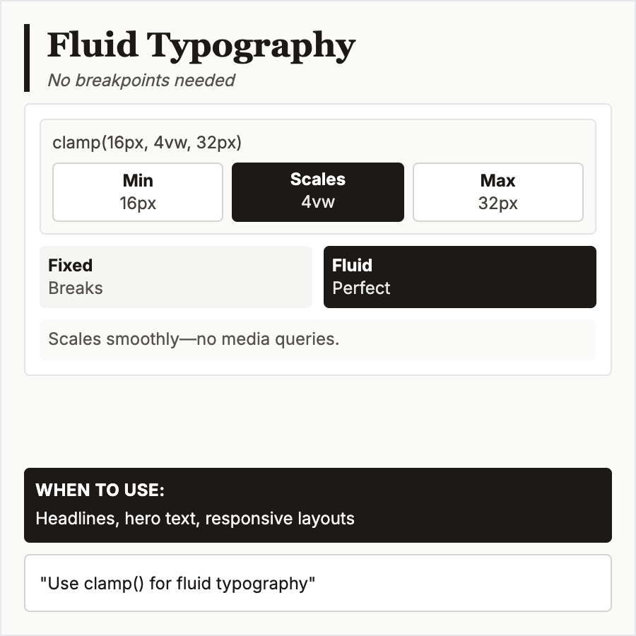
Fluid Typography scales font sizes smoothly based on viewport width using CSS clamp() and viewport units (vw). Text grows/shrinks continuously rather than jumping at breakpoints. Formula: clamp(min, preferred, max) ensures readability across all screen sizes.
When Should You Use This?
Use fluid typography for modern responsive sites, especially content-heavy designs where smooth scaling improves reading experience. Works well for headings that need dramatic size differences between mobile and desktop.
Common Mistakes to Avoid
- •Too much scaling—body text shouldn't scale dramatically; use fluid typography mainly for headings
- •Poor min/max values—ensure minimum stays readable (16px+) and maximum doesn't become comically large
- •Forgetting accessibility—users should be able to zoom; test with browser zoom
- •Complex math—use tools like utopia.fyi to calculate clamp values; manual calculation is error-prone
- •Overuse—not every element needs fluid scaling; use strategically for key typographic elements
Real-World Examples
- •Utopia.fyi—generates fluid type scales with perfect mathematical precision
- •Modern.css—design system uses fluid typography for seamless responsive experience
- •Editorial sites—many use fluid type for headlines that adapt gracefully to screen size
- •Portfolio sites—designers use fluid typography to showcase responsive typography skills
Category
Typography
Tags
fluid-typographyresponsive-typecss-clampviewport-unitsscalable