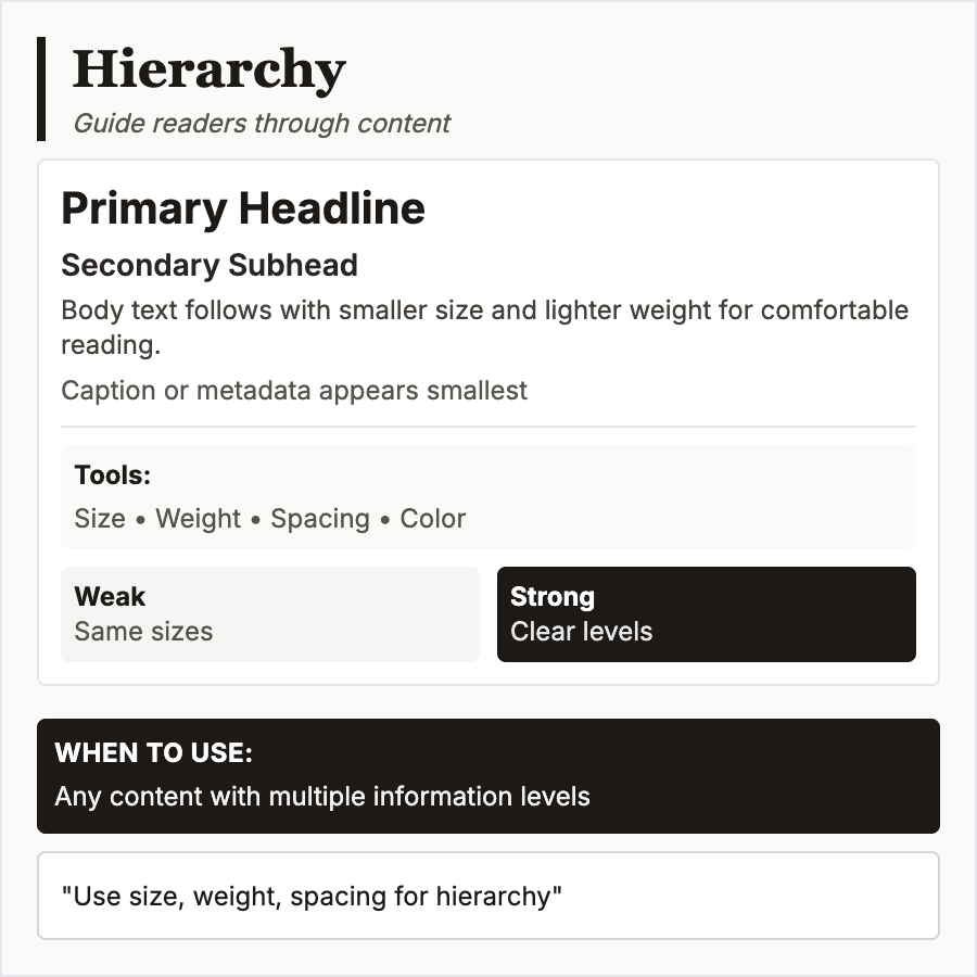
What is Typography Hierarchy?
Typography Hierarchy establishes clear visual order using size, weight (bold/regular/light), color/contrast, spacing, and typeface. Most important text (h1) should be largest/boldest, decreasing progressively to body text. Guides readers through content naturally.
When Should You Use This?
Use typography hierarchy in all interfaces—essential for readability and comprehension. Critical for content-heavy sites, documentation, articles, and any text-based interface. Without hierarchy, users can't scan or prioritize information.
Common Mistakes to Avoid
- •Insufficient contrast—h1 only slightly larger than h2 fails to establish hierarchy
- •Too many levels—stick to 3-4 heading levels in practice; more becomes confusing
- •Color only—don't rely solely on color for hierarchy; add size/weight for accessibility
- •Missing spacing—vertical rhythm (consistent spacing between elements) reinforces hierarchy
- •Breaking conventions—users expect h1 > h2 > h3; reversing this causes confusion
Real-World Examples
- •Medium—clear hierarchy: large title, medium subtitle, regular body creates easy scanning
- •Documentation sites—Stripe docs use hierarchy to distinguish headings, code, and explanations
- •News sites—NYT uses typography hierarchy to prioritize breaking news over secondary stories
- •Design systems—all systems define hierarchy levels (display, h1-h6, body, caption)
Category
Typography
Tags
typography-hierarchyvisual-hierarchytext-orderreadabilityscanning