What is Font Pairing?
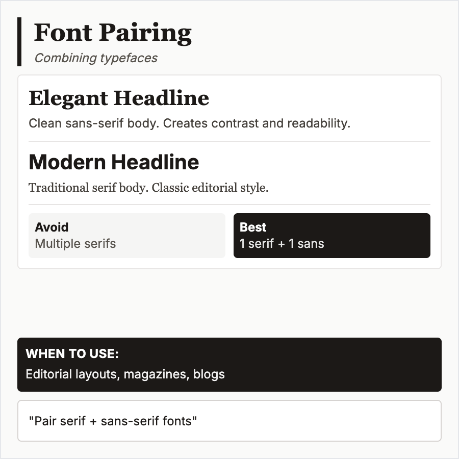
Font Pairing combines multiple typefaces to create visual hierarchy and interest. Classic approach pairs serif (for headings) with sans-serif (for body), but many combinations work. Key is ensuring sufficient contrast and compatibility between typefaces.
When Should You Use This?
Use font pairing for all digital products—differentiate headings from body text. Essential for content-heavy sites, editorial design, and branding. Even minimalist designs need at least two weights/styles for hierarchy.
Common Mistakes to Avoid
- •Too many fonts—stick to 2-3 typefaces max; more creates visual chaos
- •Too similar—fonts must have clear contrast; two similar sans-serifs confuse rather than clarify
- •Poor hierarchy—pair fonts to reinforce hierarchy, not compete; headings should command attention
- •Ignoring weights—same typeface in different weights (light, regular, bold) can work beautifully
- •Clashing styles—ensure typefaces share similar proportions and x-heights for harmony
Real-World Examples
- •Medium—Georgia (serif) for headings, system sans-serif for body creates editorial feel
- •Stripe—custom sans-serif with multiple weights eliminates need for second typeface
- •The New York Times—Cheltenham (serif) + Franklin Gothic (sans-serif) for classic editorial
- •Airbnb—Cereal (custom) uses different weights for pairing with itself
Category
Typography
Tags
font-pairingtypefacestypographyhierarchyvisual-harmony