What is Frutiger Aero Design?
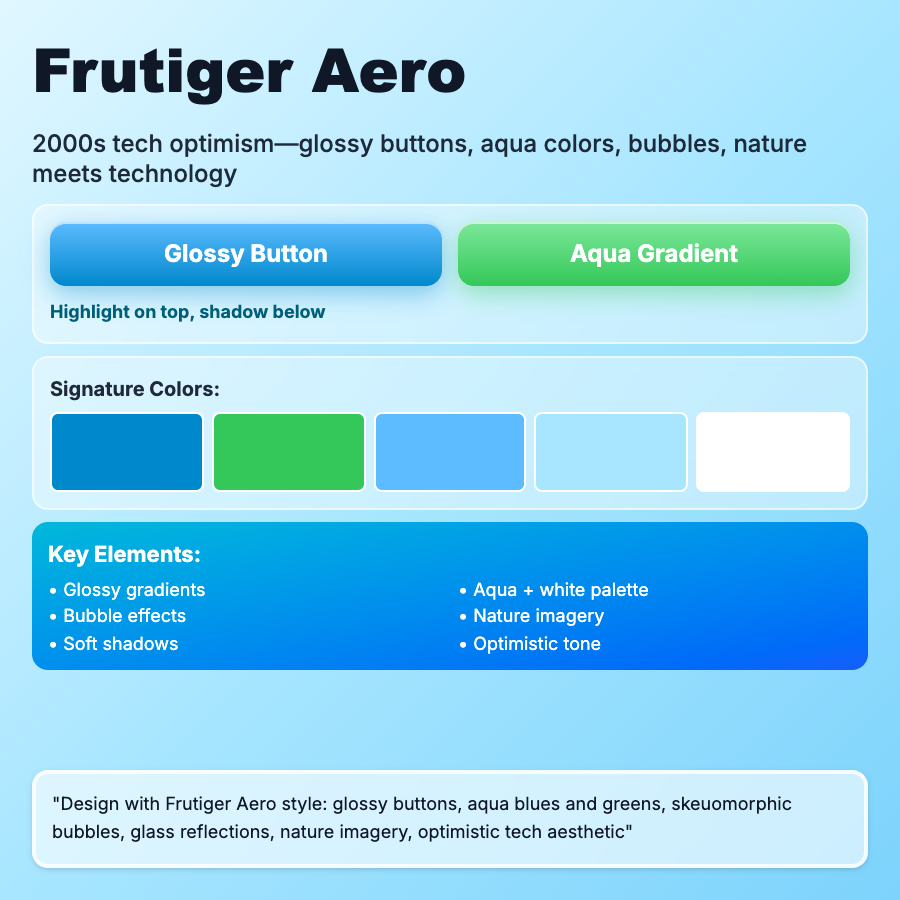
Frutiger Aero Design captures 2005-2012 tech aesthetic—glossy interfaces, nature photography (water, grass, sky), transparency effects, soft blues/greens, and optimistic corporate design. Named after Windows Vista/7 Aero interface style.
When Should You Use This?
Use frutiger aero for nostalgia projects, tech retrospectives, or brands targeting late 2000s nostalgia. Works as period-specific aesthetic for content about that era. Currently experiencing internet nostalgia resurgence.
Common Mistakes to Avoid
- •Wrong era—frutiger aero is specifically 2005-2012; don't mix with Y2K or modern
- •Missing nature—needs nature photography (water droplets, grass, bubbles); pure tech isn't frutiger aero
- •Too flat—requires glossy, dimensional elements; flat design contradicts the aesthetic
- •Wrong colors—uses soft blues, greens, silvers; bright/harsh colors break the vibe
- •Limited use case—very specific aesthetic; only use when period accuracy matters
Real-World Examples
- •Windows Vista/7—operating systems that defined the aesthetic
- •Early iPhone apps—many iOS apps used glossy, nature-inspired frutiger aero
- •Corporate tech (2005-2012)—stock photography and interfaces from this era
- •Nostalgia content—internet communities documenting 2000s tech aesthetics
Category
Aesthetic Design
Tags
frutiger-aerowindows-vistaglossy-uiaero-glass2000s-tech