What is Hamburger Menu?
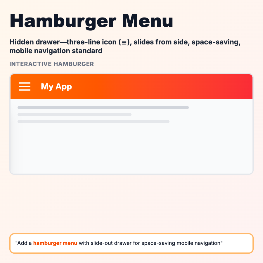
The hamburger menu is the three-line icon (☰) that opens a hidden navigation drawer. It saves screen space by hiding navigation until needed. Common on mobile sites and apps where screen space is limited. While popular, it has usability downsides—users can't see navigation options without tapping, which can reduce engagement and discoverability.
When Should You Use This?
Use hamburger menus when you have limited screen space (mobile) and many navigation items that don't fit in a bottom nav or top bar. It's acceptable for secondary/utility navigation, but avoid for primary navigation if possible—visible navigation performs better. If you have 5 or fewer main sections, use bottom nav or visible tabs instead.
Common Mistakes to Avoid
- •Hiding primary navigation—users don't explore menus they can't see
- •No label—just the icon confuses some users, add "Menu" text
- •Slow animation—drawer should open instantly, not slide in slowly
- •No close button—users should be able to close it easily
- •Using on desktop—there's usually space for visible navigation on larger screens
Real-World Examples
- •Medium mobile—hamburger for secondary nav, visible tabs for primary content
- •YouTube mobile—hamburger reveals account, settings, and secondary features
- •Gmail mobile—hamburger for account switching and folder navigation
- •Most news sites—hamburger for section navigation on mobile
Category
Navigation Patterns
Tags
navigationmobilehamburgerdrawerui-pattern