What is Luxury Minimalism?
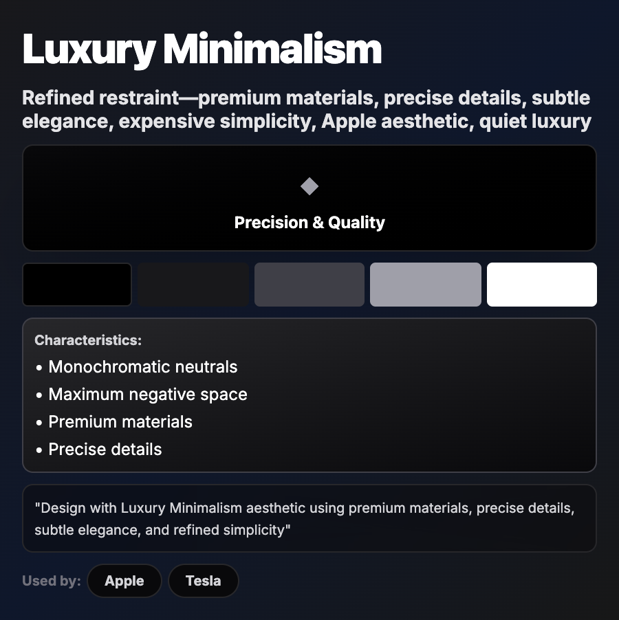
Luxury Minimalism combines minimalist restraint with premium execution—sophisticated typography, subtle animations, generous white space, muted color palettes (often monochromatic), and attention to micro-details. Communicates quality through restraint rather than ornamentation.
When Should You Use This?
Use luxury minimalism for high-end fashion, jewelry, watches, premium SaaS, luxury real estate, or professional services. Works well for brands targeting affluent audiences who value quality and sophistication over flash.
Common Mistakes to Avoid
- •Cheap execution—luxury minimalism requires perfect typography, spacing, and details; sloppy = cheap
- •Too minimal—need subtle richness (textures, animations, premium photography) to convey luxury
- •Wrong typography—requires high-quality, sophisticated fonts; system fonts feel generic
- •Missing polish—every detail must be perfect; inconsistent spacing breaks the illusion
- •Poor photography—luxury minimalism needs excellent, professionally lit product photography
Real-World Examples
- •The Row—fashion brand uses extreme luxury minimalism with perfect typography
- •Apple—product pages combine minimalism with premium materials and sophisticated details
- •Aesop—skincare brand uses monochromatic luxury minimalism with classical typography
- •Rolls-Royce—automotive brand showcases luxury minimalism in digital presence
Category
Aesthetic Design
Tags
luxury-minimalismunderstated-elegancepremium-designsophisticatedhigh-end