What is Modals?
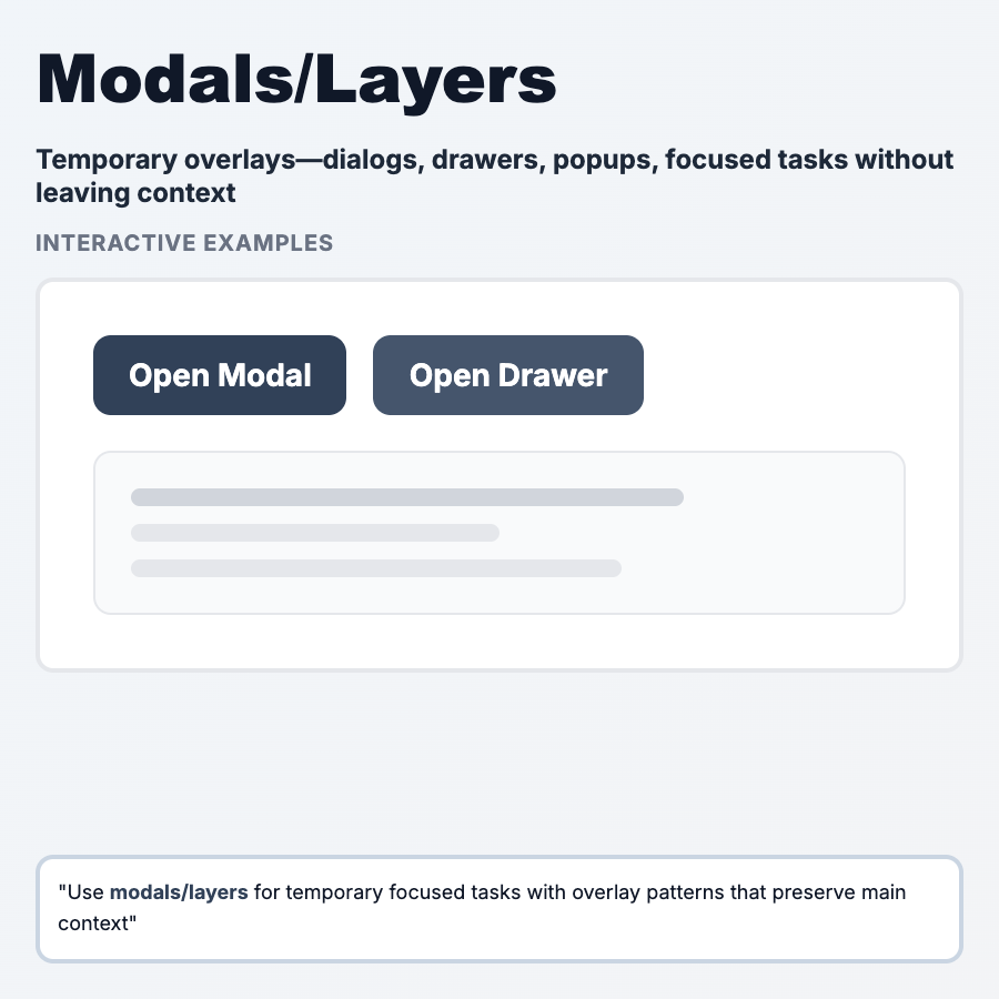
Modals are overlay windows that appear on top of the main content, requiring user interaction before continuing. Used for critical decisions, forms, alerts, or focused tasks. Block interaction with underlying page until dismissed. Powerful but easily overused.
When Should You Use This?
Use modals for critical confirmations (delete account, unsaved changes), focused tasks (quick add, simple forms), alerts/errors that require acknowledgment, or content that shouldn't interrupt main flow (image lightbox, video player). Keep them small, focused, and dismissible. Don't use for lengthy forms, content users need to reference, or frequent actions.
Common Mistakes to Avoid
- •Modal for everything—overuse trains users to dismiss without reading; reserve for important moments
- •No escape hatch—always allow closing via X, ESC key, or click outside (unless critical)
- •Too much content—modals should be scannable; >1 screen of content should be full page
- •Nested modals—modal opening modal is UX nightmare; avoid
- •Mobile modals—often full-screen on mobile anyway; consider drawer or new page instead
Real-World Examples
- •Gmail—compose email in modal (can minimize to continue browsing)
- •Linear—quick add issue in modal, keeps context
- •Figma—share modal with copy link, permissions, embed options
- •Stripe dashboard—confirmation modals for destructive actions
Category
Information Architecture
Tags
modalsdialogoverlaypopupui-pattern