What is Monochromatic Design?
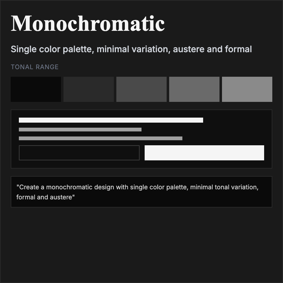
Monochromatic Design uses variations of a single hue—different shades, tints, and tones of one color. Creates extremely cohesive, sophisticated aesthetic. Relies on contrast in value (lightness/darkness) rather than hue for hierarchy.
When Should You Use This?
Use monochromatic for luxury brands, minimalist products, editorial design, photography portfolios, or brands with strong signature colors. Works well when you want restrained, sophisticated appearance or to highlight content over UI.
Common Mistakes to Avoid
- •Too flat—need sufficient value contrast between elements; pure monochrome lacks depth
- •Boring execution—monochromatic doesn't mean lifeless; vary saturation and value creatively
- •Poor hierarchy—without color variety, must use size, weight, and spacing for hierarchy
- •Missing accents—sometimes need neutral accent (black/white/gray) for critical elements
- •Wrong color choice—not all colors work monochromatically; test with brand color
Real-World Examples
- •Aesop—skincare brand uses monochromatic browns for sophisticated, natural feel
- •Photography portfolios—many use monochromatic to let photos be the color
- •Fashion brands—monochromatic black or white creates luxury, minimalist aesthetic
- •Product landing pages—Apple occasionally uses monochromatic approach for product launches
Category
Aesthetic Design
Tags
monochromaticsingle-colortonalcolor-harmonyminimalist-color