What is Risograph Design?
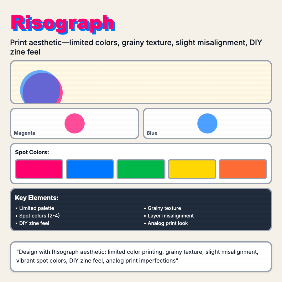
Risograph Design mimics Japanese stencil duplicator printing—limited spot colors (typically 2-3), texture/grain, slight misalignment, vibrant overlays, and analog imperfections. Creates warm, handmade aesthetic popular in zines and independent publishing.
When Should You Use This?
Use risograph for independent publishers, zines, creative projects, artisan brands, or products emphasizing handmade/analog aesthetics. Works well for brands targeting design-conscious, indie audiences.
Common Mistakes to Avoid
- •Too perfect—risograph has organic misalignment and texture; perfect digital version misses charm
- •Too many colors—risograph typically uses 2-3 spot colors; 4+ colors is offset printing
- •Wrong colors—risograph has specific color set (fluorescents, flat colors); CMYK isn't riso
- •Missing texture—grain and texture are essential; smooth gradients aren't riso
- •Digital execution—if creating digital, embrace the constraints (limited colors, overprint)
Real-World Examples
- •Independent publishers—many zines and art books use risograph printing
- •Design studios—creative agencies use riso aesthetic for projects and self-promotion
- •Art prints—artists create limited edition prints with risograph for unique character
- •Indie magazines—small-run publications embrace riso for affordability and aesthetic
Category
Aesthetic Design
Tags
risographriso-printlimited-colorprint-textureanalog