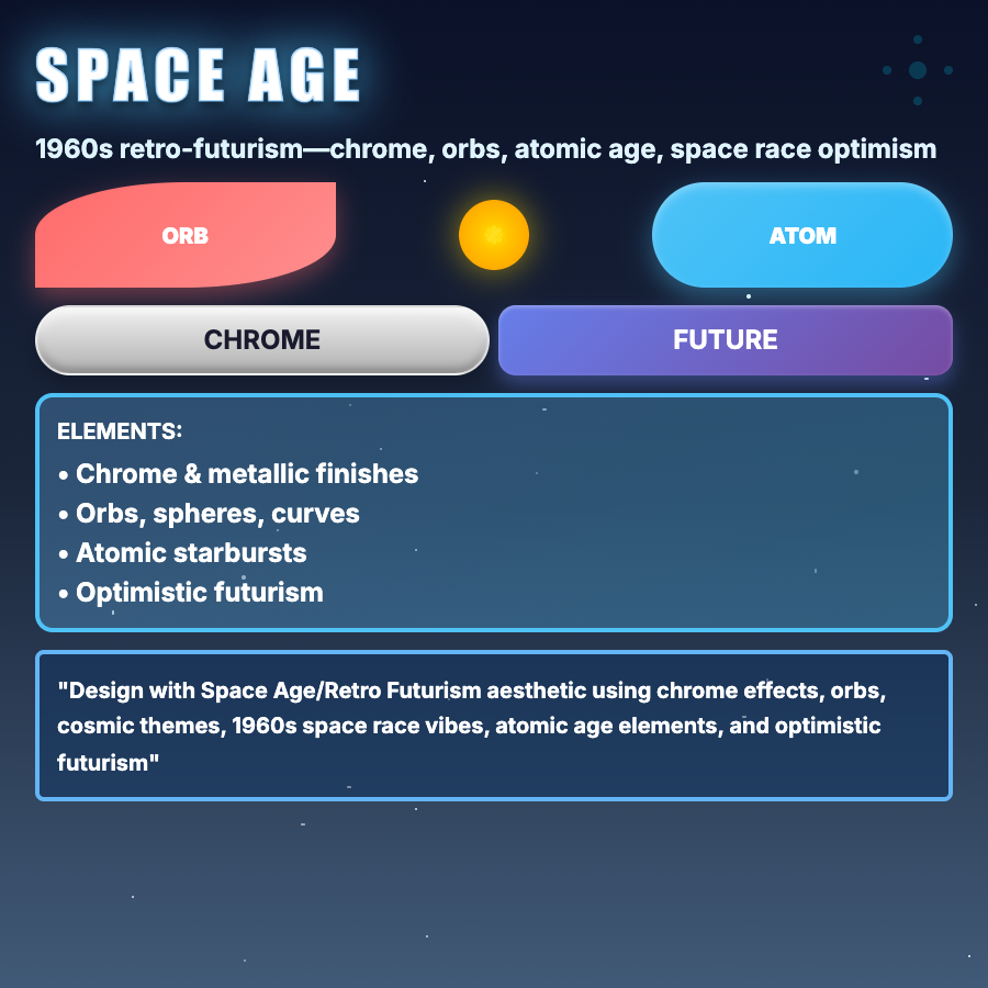
What is Space Age Design?
Space Age Design captures 1960s futuristic optimism—atomic/orbital shapes, metallic finishes, bubble elements, white/chrome color schemes, and mid-century modern influence. Represents space race era's optimistic vision of the future.
When Should You Use This?
Use space age for tech products with retro angle, design/furniture brands, creative projects, or brands wanting optimistic futurism. Works for products emphasizing innovation with playful, nostalgic edge.
Common Mistakes to Avoid
- •Wrong era—space age is specifically 60s/early 70s; don't mix with 80s or modern futurism
- •Missing optimism—space age is optimistic, not dystopian; keep tone upbeat
- •Too literal—don't need rockets everywhere; shapes and colors evoke the era
- •Poor execution—requires quality graphics; cheap space age looks dated
- •Wrong colors—space age uses white, chrome, orange, teal; wrong palette breaks aesthetic
Real-World Examples
- •Herman Miller—furniture brand showcases mid-century/space age design heritage
- •Tech retrospectives—companies use space age for "history of innovation" content
- •Design museums—exhibitions on 60s design adopt space age aesthetics
- •Retro appliance brands—Smeg uses space age curves and colors
Category
Aesthetic Design
Tags
space-ageretro-futurism60s-futurismatomicmid-century