What is Typography Contrast?
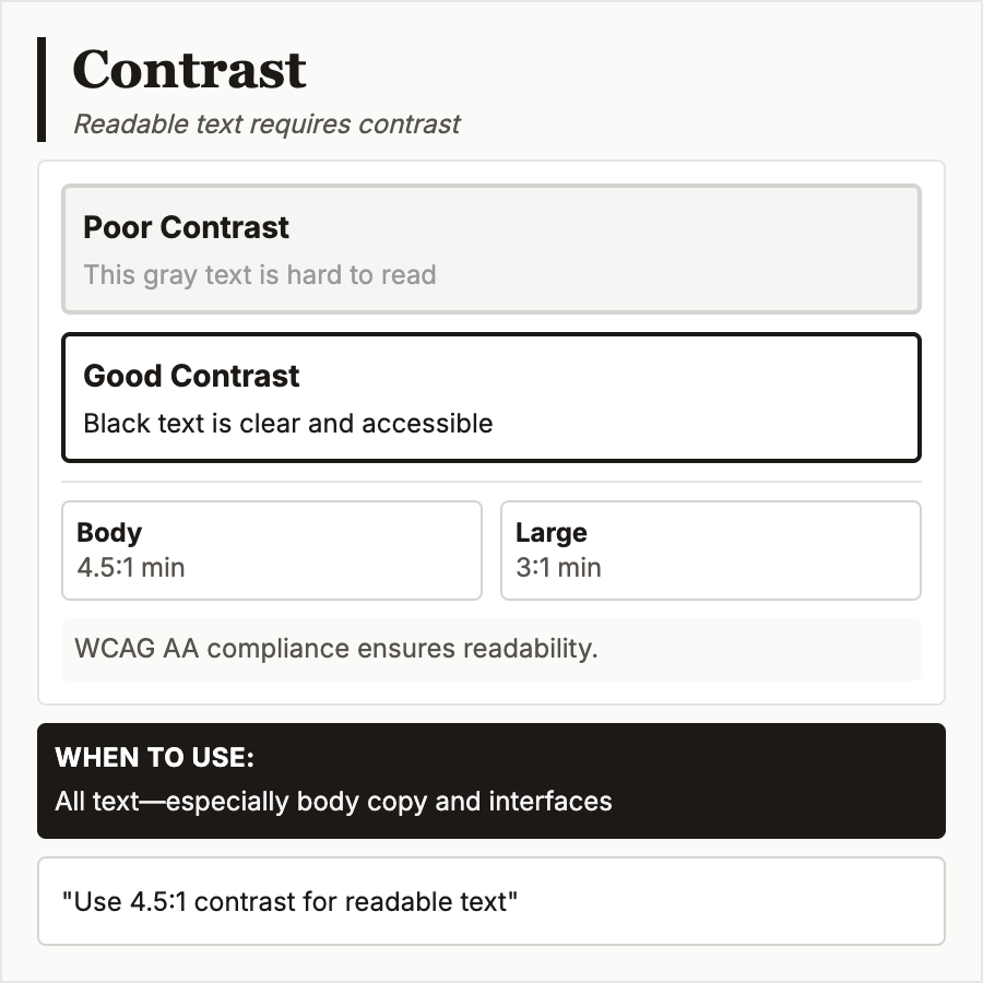
Typography Contrast measures color difference between text and background using contrast ratio. WCAG AA requires 4.5:1 for normal text (<18pt), 3:1 for large text (≥18pt or bold ≥14pt). AAA level requires 7:1 and 4.5:1 respectively. Essential for accessibility and readability.
When Should You Use This?
Always ensure sufficient contrast for all text—legal requirement (ADA, Section 508) and critical for accessibility. Test with tools like WebAIM Contrast Checker. Pay special attention to gray text, overlays, and colored backgrounds.
Common Mistakes to Avoid
- •Light gray text—#999 on white fails WCAG; use #757575 or darker for normal text
- •Text on images—photos/gradients make contrast unpredictable; add overlays or shadows
- •Colored text—blue links on gray backgrounds often fail; test all color combinations
- •Ignoring large text—18pt+ text can use lower contrast, but don't push it too far
- •Dark mode oversight—text contrast in dark mode needs separate consideration and testing
Real-World Examples
- •WebAIM Contrast Checker—essential tool for testing text contrast ratios
- •Material Design—provides color palette with accessible text contrast recommendations
- •Apple accessibility—uses system contrast ratios and offers increased contrast mode
- •Government sites—.gov sites must meet WCAG AA at minimum for Section 508 compliance
Category
Typography
Tags
typography-contrasttext-contrastwcagaccessibilitylegibility