What is Wabi-Sabi Design?
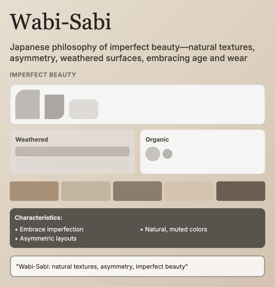
Wabi-Sabi Design embraces imperfection, transience, and natural beauty—Japanese philosophy applied to digital design. Features earthy colors, organic textures, asymmetric layouts, natural materials (wood, stone, paper textures), and acceptance of flaws. Values authenticity over polish.
When Should You Use This?
Use wabi-sabi for wellness brands, sustainable products, pottery/artisan goods, meditation apps, or brands emphasizing natural, handmade, or authentic values. Works well for products targeting mindful, eco-conscious audiences.
Common Mistakes to Avoid
- •Too perfect—wabi-sabi requires intentional imperfection; overly polished execution misses the point
- •Wrong textures—use natural materials (wood, linen, clay); digital gradients contradict the philosophy
- •Too much imperfection—embrace flaws intentionally, but maintain usability and legibility
- •Missing warmth—wabi-sabi uses warm, earthy tones; cool grays feel too corporate
- •Ignoring philosophy—wabi-sabi is about values (transience, humility); superficial styling fails
Real-World Examples
- •Kinfolk—lifestyle magazine uses wabi-sabi aesthetics with natural photography and earthy tones
- •Calm—meditation app incorporates wabi-sabi principles with organic shapes and warm colors
- •Artisan e-commerce—Etsy sellers of pottery/ceramics often use wabi-sabi design language
- •Japanese ryokan sites—traditional inn websites embrace wabi-sabi with natural imagery
Category
Aesthetic Design
Tags
wabi-sabiimperfect-beautyjapanese-aestheticnatural-materialsorganic