What is Bento Layout?
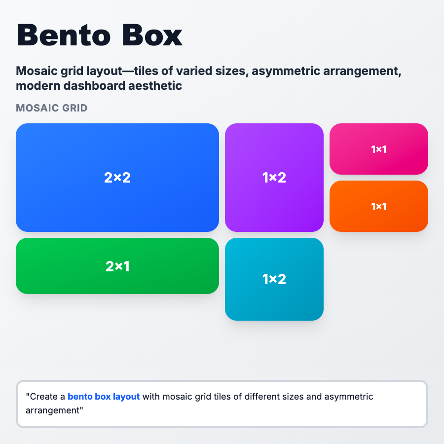
Bento Layout (named after Japanese bento boxes) arranges content in asymmetric grid cells with varying sizes. It combines card-based design with masonry-style composition, creating visual interest through mixed proportions. Popular in modern landing pages, dashboards, and portfolio sites for dynamic, non-uniform layouts.
When Should You Use This?
Use bento layout for landing pages showcasing multiple features (Linear, Raycast), marketing sites with visual storytelling, portfolio sites highlighting diverse projects, dashboard overview screens with metrics and quick actions, and component libraries displaying varied content types. Choose this when visual hierarchy and scannable content matter more than strict uniformity.
Common Mistakes to Avoid
- •Overcomplexity—too many different cell sizes creates chaos; limit to 3-4 size variations
- •Mobile breakpoint issues—bento grids often collapse poorly on mobile; design mobile-first with simpler grid
- •Poor content prioritization—largest cells should contain most important content; use size intentionally
- •Missing alignment—cells should align to consistent grid system; avoid arbitrary positioning
- •Accessibility neglect—screen readers navigate top-to-bottom by DOM order, not visual layout; ensure logical HTML structure
Real-World Examples
- •Linear—homepage uses bento layout with large hero, medium feature cards, small testimonials in asymmetric grid
- •Raycast—features page displays commands, shortcuts, and screenshots in varied-size bento boxes
- •Apple—product pages often use bento-style layouts mixing large product images with smaller feature callouts
- •Notion—template gallery shows templates in bento grid with different aspect ratios for categories
Category
Layouts
Tags
bento-layoutbento-gridasymmetric-gridcomponent-layoutmodern-layout