What is Card Grid Layout?
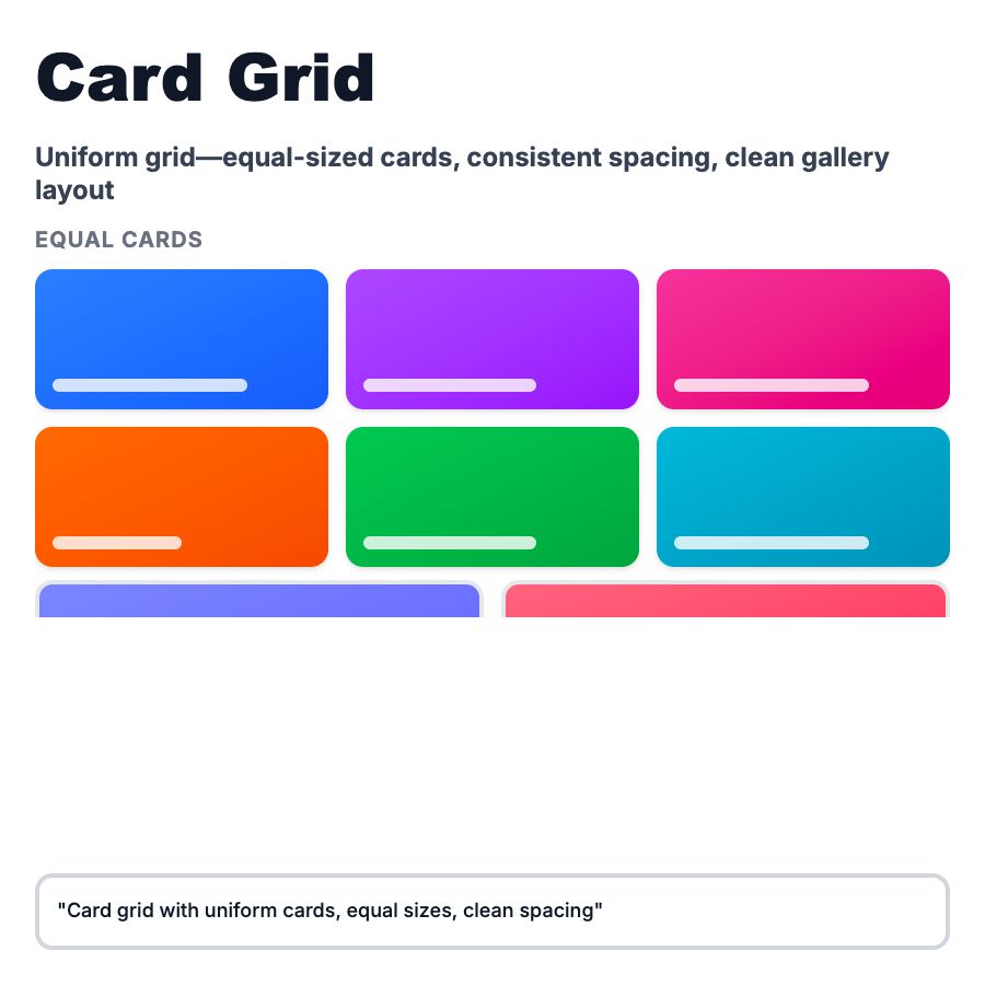
Card Grid Layout arranges content in uniform cards with consistent widths and heights (or aspect ratios) in rows and columns. Unlike masonry, cards align to strict grid with equal sizing, creating clean, predictable structure. Standard for product catalogs, blog archives, team pages, feature showcases, and content libraries where consistency matters.
When Should You Use This?
Use card grid layout for product catalogs and e-commerce listings, blog post archives, team member pages and directories, feature comparison pages, app galleries and template libraries, and resource centers. Choose this when content types are similar in structure and visual consistency aids scannability and comparison.
Common Mistakes to Avoid
- •Forcing equal heights—truncating content to fit cards often hides important information; allow some height variation
- •Too many columns—more than 4 columns on desktop makes cards too small; optimize for readability
- •Poor mobile stack—cards that don't adapt well to single-column mobile view; design mobile-first
- •Missing hover states—cards benefit from interactive feedback; add subtle hover effects
- •No empty states—grids with no items look broken; design meaningful empty states with CTAs
Real-World Examples
- •Vercel—template gallery displays project templates in 3-column card grid with previews
- •Stripe—customer stories page uses card grid for case studies with logo, quote, and CTA
- •Notion—template gallery shows templates in consistent card grid with icons and descriptions
- •GitHub—repository search results display repos in card grid with stars, description, and language
Category
Layouts
Tags
card-gridgrid-layoutcard-layoutproduct-gridcontent-grid