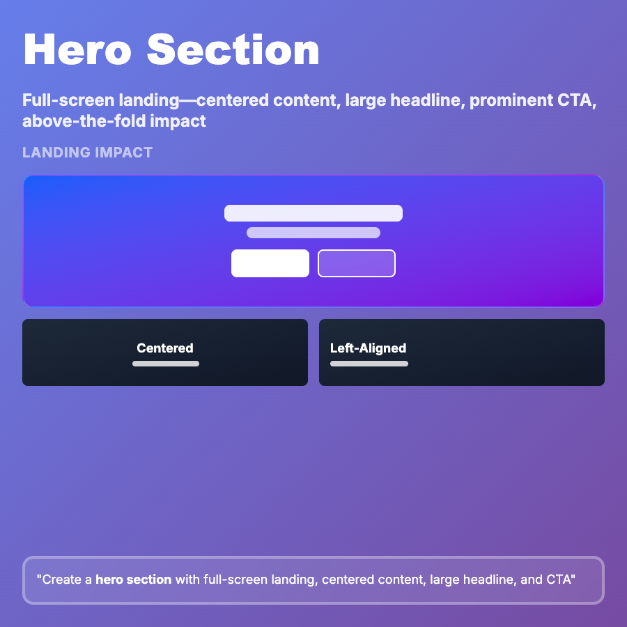
What is Hero Section?
Hero Section is the prominent above-the-fold content at the top of landing pages—typically includes large headline, supporting copy, primary CTA button, and hero image or video. It serves as the first impression and should communicate value proposition within seconds. Standard in marketing sites, SaaS homepages, and product pages.
When Should You Use This?
Use hero section for landing pages and marketing homepages (Stripe, Vercel), product pages introducing new features, campaign-specific landing pages for ads/email, event registration pages, and app download pages. Choose this when making strong first impression and driving immediate action are critical goals.
Common Mistakes to Avoid
- •Vague headline—generic copy like "Better software" doesn't explain value; be specific about benefit
- •Weak CTA—"Learn more" vs "Start free trial"; use action-oriented, specific language
- •Image-text imbalance—hero image competing with headline for attention; ensure text is readable
- •Too much content—paragraphs of text above fold overwhelm; keep to headline + 1 sentence + CTA
- •Missing mobile optimization—hero sections often too tall on mobile, pushing CTA below fold; optimize height
Real-World Examples
- •Stripe—hero: "Financial infrastructure for the internet" with "Start now" CTA and abstract visual
- •Vercel—hero: "Build and deploy in seconds" with signup form directly in hero section
- •Linear—hero: "Built for modern software teams" with product screenshot showing actual interface
- •Notion—hero: "Your wiki, docs & projects. Together" with "Get Notion free" CTA and animated demo
Category
Layouts
Tags
hero-sectionhero-bannerabove-the-foldlanding-pageheadline-layout