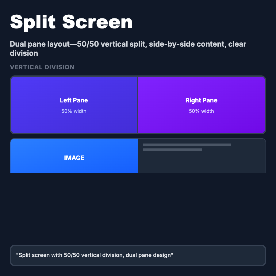
What is Split Screen Layout?
Split Screen Layout divides the viewport into two distinct sections—typically 50/50 or 60/40 split horizontally. One side usually contains content (text, form) while the other shows supporting visuals (image, video, demo). Common in landing pages, onboarding flows, pricing comparisons, and before/after presentations where equal emphasis on two elements is needed.
When Should You Use This?
Use split screen layout for authentication pages (login/signup with brand visual), onboarding flows showing features + demo, pricing page comparisons (free vs paid), before/after presentations (case studies, testimonials), and landing pages with text + hero image. Choose this when two pieces of content deserve equal visual weight and viewport space.
Common Mistakes to Avoid
- •Mobile neglect—split screens must stack vertically on mobile; plan content priority for stacking order
- •Unbalanced content—one side significantly longer than other creates awkward whitespace; balance heights
- •Poor breakpoints—splits that don't transition smoothly across tablet sizes; test extensively
- •Missing scroll sync—when both sides scroll, users can lose context; consider sticky or synced scrolling
- •Accessibility issues—screen readers may jump between sides unpredictably; ensure logical DOM order
Real-World Examples
- •Stripe—login page splits auth form (left) and gradient brand visual (right) 50/50
- •Linear—onboarding flow uses split screen with features (left) and product demo (right)
- •Notion—pricing page compares Free vs Paid plans side-by-side in split columns
- •Apple—product pages often use split screen with product copy (left) and large product image (right)
Category
Layouts
Tags
split-screentwo-column-layoutdivided-layoutbefore-aftercomparison-layout