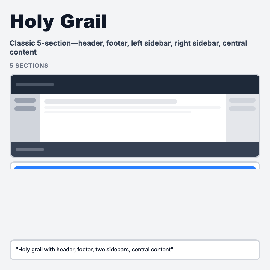
What is Holy Grail Layout?
Holy Grail Layout is the classic web structure: header, three columns (left navigation, main content, right sidebar), and footer—with equal-height columns and sticky sidebars. The name comes from it being a "holy grail" of CSS layout patterns before flexbox/grid. Common in documentation sites, blogs, forums, and content-heavy web apps where persistent navigation and contextual sidebars add value.
When Should You Use This?
Use holy grail layout for documentation sites (MDN, Stripe Docs), blog platforms with sidebars (Medium, WordPress), forum and community platforms (Stack Overflow, Reddit), learning management systems, and content-rich web apps. Choose this when users need persistent navigation, contextual information, and deep content hierarchy.
Common Mistakes to Avoid
- •Mobile sidebar issues—three columns don't fit mobile; plan hamburger menu or bottom nav alternative
- •Content too narrow—sidebars eating too much width makes main content cramped; optimize proportions
- •Sidebar overload—stuffing too much in sidebars distracts from main content; prioritize ruthlessly
- •No sticky headers—losing navigation on scroll requires backtracking; implement sticky header/nav
- •Poor semantic HTML—using divs for layout instead of semantic elements hurts SEO and accessibility
Real-World Examples
- •Stripe Docs—left nav (docs hierarchy), main content (article), right sidebar (table of contents)
- •MDN Web Docs—classic holy grail with left nav, content, and right "In this article" sidebar
- •Stack Overflow—left nav (sections), main content (questions), right sidebar (related, tags, ads)
- •Reddit—left nav (communities), feed (posts), right sidebar (community info, rules)
Category
Layouts
Tags
holy-grail-layoutthree-column-layoutclassic-layoutweb-layoutsticky-sidebar