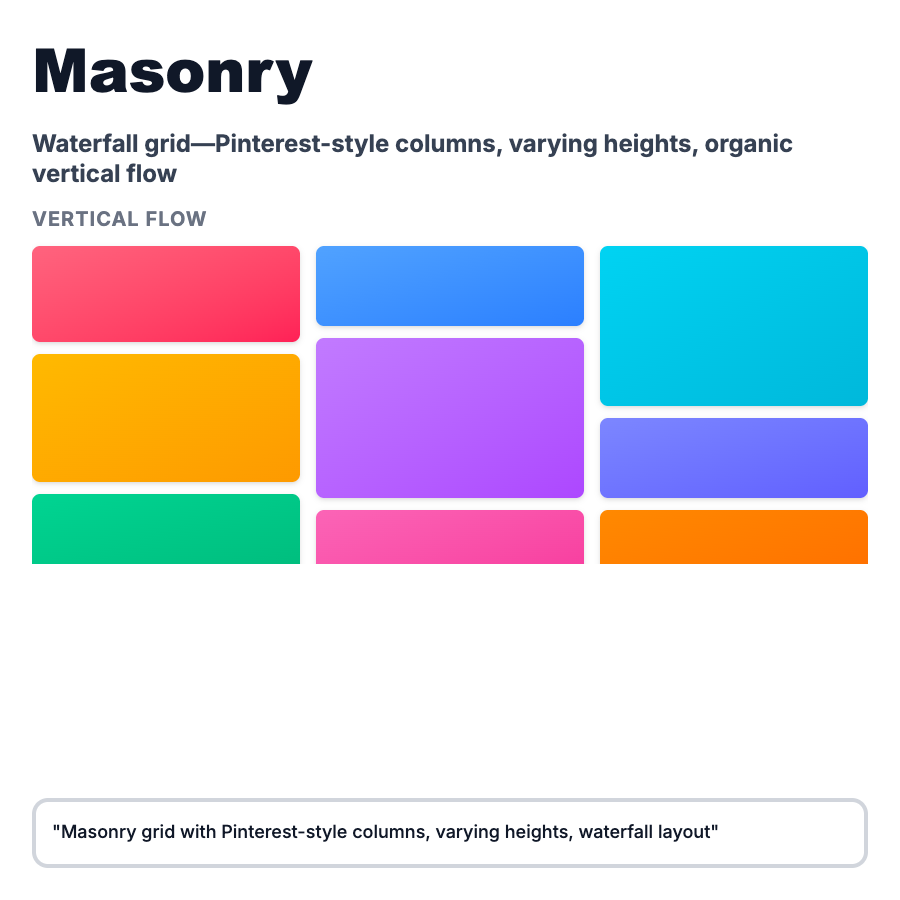
What is Masonry Layout?
Masonry Layout arranges content in vertical columns where items flow into the next available space, creating a Pinterest-style "waterfall" effect. Unlike standard grids, item heights vary and columns fill vertically to minimize gaps. Perfect for image galleries, product catalogs, and content discovery interfaces where items have different aspect ratios.
When Should You Use This?
Use masonry layout for image galleries and photo sharing (Pinterest, Unsplash), product catalogs with varied image sizes (Etsy, Dribbble), blog archives with featured images, portfolio sites showcasing projects, and design inspiration galleries (Behance, Awwwards). Choose this when content has naturally varying heights and visual browsing is primary interaction.
Common Mistakes to Avoid
- •Infinite scroll without virtualization—loading hundreds of images tanks performance; implement virtual scrolling
- •No grid fallback—masonry requires JavaScript; provide CSS grid fallback for progressive enhancement
- •Poor aspect ratio handling—extreme aspect ratios (very tall or wide) break layout; enforce reasonable limits
- •Missing keyboard navigation—visual layouts often forget accessibility; ensure logical tab order
- •No loading states—masonry jumps as images load; use skeleton screens or fixed aspect ratio containers
Real-World Examples
- •Pinterest—classic masonry for pins with varying heights, infinite scroll, and hover interactions
- •Unsplash—photo grid uses masonry to showcase photography with different aspect ratios
- •Dribbble—shot gallery displays design work in masonry grid with consistent width, varying heights
- •Notion—template gallery uses masonry-style layout for template cards with different content lengths
Category
Layouts
Tags
masonry-layoutpinterest-layoutwaterfall-gridimage-gallerycolumn-layout