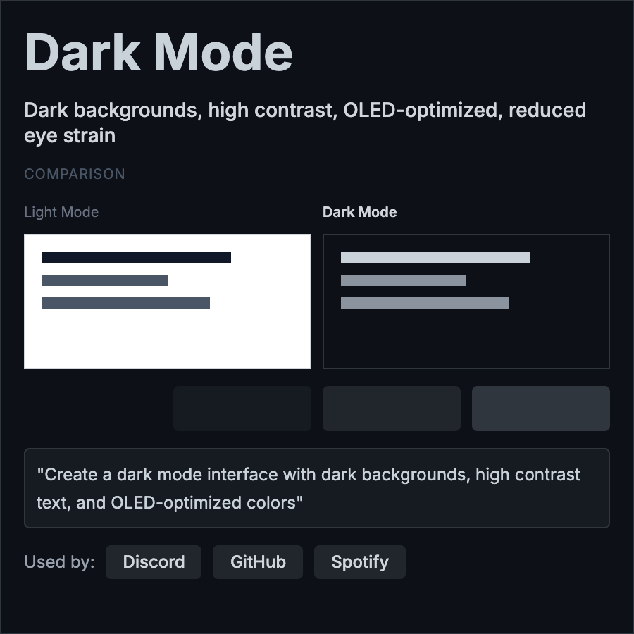
What is Dark Mode Design?
Dark Mode Design uses dark backgrounds (typically near-black) with light text for reduced eye strain in low-light environments. Modern expectation rather than aesthetic choice. Requires careful color selection to maintain hierarchy and accessibility.
When Should You Use This?
Offer dark mode for all digital products as user preference option. Essential for apps used at night or in low-light. Some products (creative tools, code editors) default to dark mode. Always provide both light and dark options.
Common Mistakes to Avoid
- •Pure black (#000)—use dark gray (#121212) for backgrounds; pure black causes smearing on OLED
- •Inverting colors—dark mode isn't light mode inverted; requires separate design consideration
- •Poor contrast—ensure text has sufficient contrast on dark backgrounds (WCAG standards)
- •Missing shadows—add subtle shadows and elevation even in dark mode for hierarchy
- •Saturated colors—reduce color saturation in dark mode; vibrant colors on dark burn eyes
Real-World Examples
- •iOS/macOS—Apple provides system-wide dark mode with automatic switching
- •Twitter/X—offers dark mode with multiple darkness levels (dim, lights out)
- •Slack—dark mode essential for productivity tool used throughout day
- •Code editors—VSCode, Sublime default to dark themes for reduced eye strain
Category
Aesthetic Design
Tags
dark-modedark-themenight-modeaccessibilityeye-strain