What is Neo-Brutalist Design?
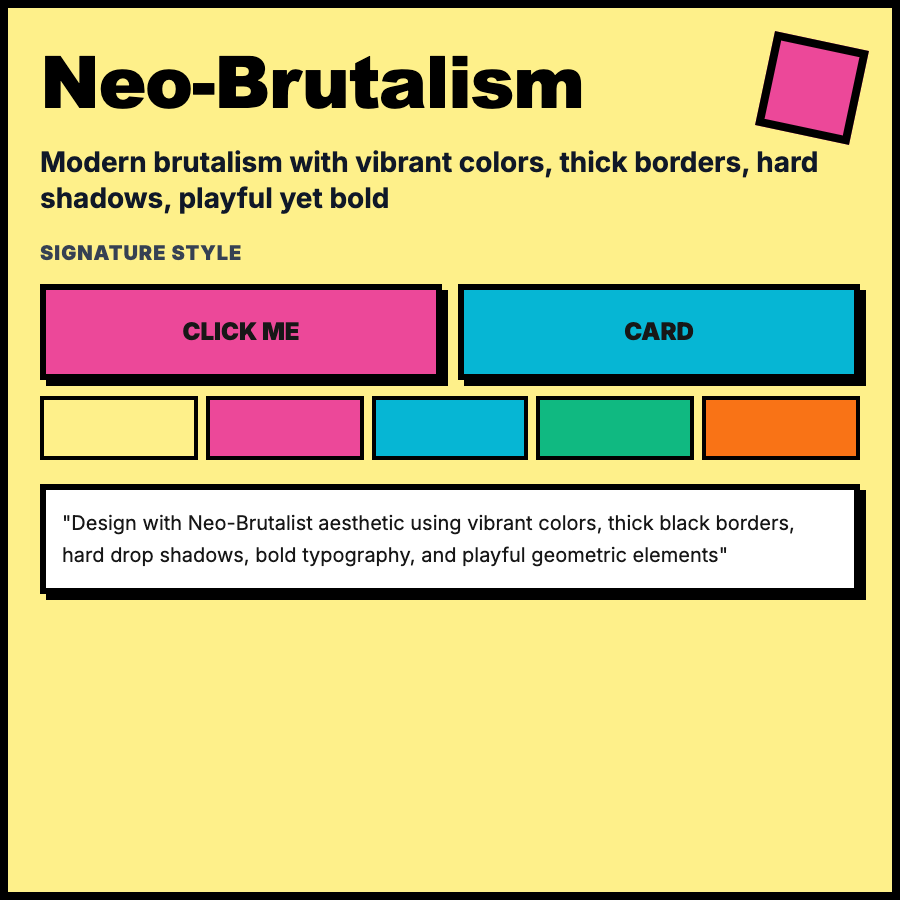
Neo-Brutalist Design takes brutalism's raw aesthetic but makes it functional and user-friendly. Features thick black borders, flat bold colors, harsh drop shadows, geometric shapes, and confident typography—but maintains proper usability and polish. More accessible than pure brutalism.
When Should You Use This?
Use neo-brutalism for creative tools, design agencies, crypto/web3 products, gen-z focused apps, or when you want edgy but still usable. Works for products that want to stand out from corporate SaaS but need to actually function well.
Common Mistakes to Avoid
- •Overdoing borders—every element doesn't need 3px black borders; use hierarchy
- •Poor color choices—bold colors must still have sufficient contrast for accessibility
- •Missing shadows—neo-brutalism uses harsh shadows for depth; flat everything looks unfinished
- •Inconsistent stroke weights—pick 2-3 border weights (1px, 2px, 3px) and stick to them
- •Breaking usability—style shouldn't compromise interaction patterns users expect
Real-World Examples
- •Gumroad—creator platform uses neo-brutalist cards with bold borders and colors
- •Cosmos—web3 ecosystem site with geometric shapes, bold typography, harsh shadows
- •Figma plugins—many use neo-brutalist UI to stand out in the plugin marketplace
- •Linear Changelog—uses elements of neo-brutalism with bold borders and colors
Category
Aesthetic Design
Tags
neo-brutalistbold-bordersharsh-shadowsgeometricmodern-brutalism