What is Bar Chart?
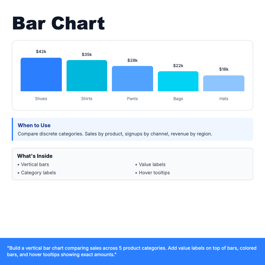
Bar chart uses vertical or horizontal bars to compare discrete categories. Bar height represents value. Ideal for comparing sales by product, signups by channel, or any categorical data. Use consistent colors or gradient palettes. Add value labels on top of bars for exact numbers.
When Should You Use This?
Compare discrete categories: sales by product type, revenue by region, signups by traffic source. Works best with 3-12 categories. More categories? Consider horizontal bars or grouping. Vertical bars are standard, horizontal bars work better for long category names.
Common Mistakes to Avoid
- •Inconsistent bar widths—all bars should be same width for fair comparison
- •Missing value labels—show exact numbers on or above bars
- •3D bars—avoid 3D effects, they distort perception of values
- •Starting Y-axis above zero—always start at zero for accurate comparison
Real-World Examples
- •E-commerce dashboard—sales by product category with color-coded bars
- •Marketing report—signups by channel (organic, paid, referral)
- •Survey results—responses by option, horizontal bars with percentages
Category
Data Visualization
Tags
bar-chartbar-graphcomparisoncategorieshistogramdata-viz