What is Line Chart?
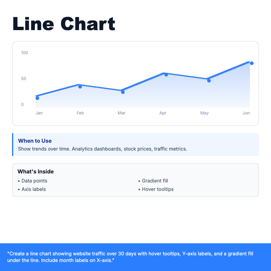
Line chart displays data points connected by straight lines, ideal for showing trends over continuous time periods. X-axis typically represents time (days, months, years), Y-axis shows values. Use gradient fills, hover tooltips, and axis labels for clarity. Common in analytics dashboards, stock tickers, and traffic metrics.
When Should You Use This?
Perfect for time-series data: website traffic, revenue over time, stock prices, temperature readings. Use when you need to show trends, patterns, or changes over continuous periods. Works best with 10-100 data points. More than 100 points may need aggregation or zooming functionality.
Common Mistakes to Avoid
- •Starting Y-axis at arbitrary number—can make changes look dramatic or flat
- •Too many lines on one chart—limit to 3-5 for readability
- •No hover tooltips—users need exact values on data points
- •Missing axis labels—always label X and Y axes with units
Real-World Examples
- •Google Analytics—website traffic over 30 days with gradient fill
- •Stock charts—price movement with volume bars underneath
- •Dashboard KPIs—revenue, signups, active users over time
Category
Data Visualization
Tags
line-charttime-seriesanalyticsdashboardtrendgraphdata-viz